Use correlation analysis to uncover hidden patterns in UX research data
Understanding the gathered research data is usually where researchers spend most of their time.
- What set of segments is experiencing this pain-point the most?
- What pain-point occurs with which feature request most often?
- How many people in segment A also belong to segment B?
Finding answers to questions like above are essential but difficult to observe in qualitative data. Thankfully, the powerful correlation analysis tools on UserBit can help you quickly uncover these complex patterns and relationships. In this article, we'll go over the various features on the correlation tab that can help get the most out of your analysis.
Correlation Analysis on UserBit
Before you begin analysis, make sure you've gone through and tagged your data with the essential segment (demographic) and behavioral tags. Properly tagged data is a lot easier to analyze and can bring up valuable insights much faster.
A Quick Refresher
Before we dive into correlation analysis, lets refresh a few key concepts from our interview analysis guide.
- Segment tags - segment tags are tags that we apply directly to participants. They usually represent demographic attributes like age, location, team-size, education level, etc.
- Highlight tags - highlight tags are tags that we apply to participants' content to highlight behavioral attributes. For example, highlighting a pain point on an interview response, or a feature request on a survey response, or a frustration captured in notes, etc.
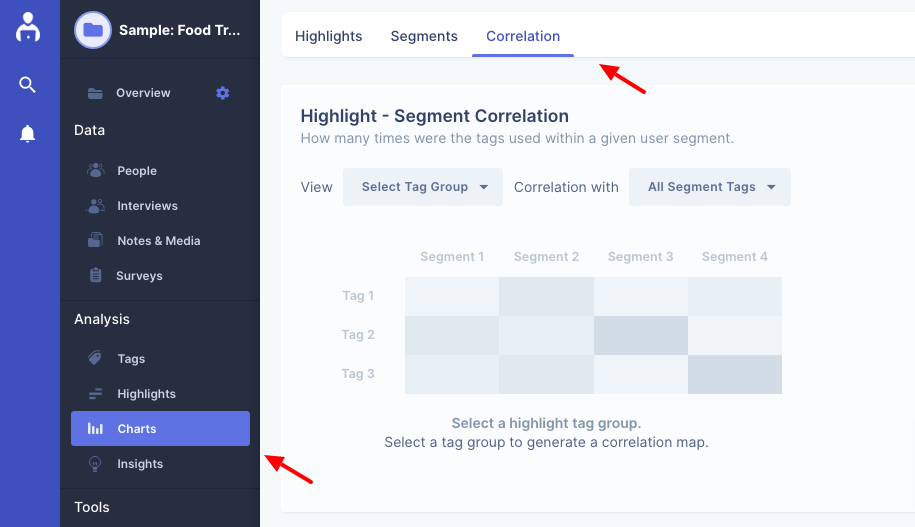
Ok, now that we understand what highlight and segment tags are, let's get back to correlation. To get to the correlation tab within a project, go to the Charts section and then click on Correlation tab.
On this screen, there are three types of correlations that we can explore.
- Highlight - segment correlation - To view which segments experienced/or talked about a set of behavioral attributes (highlights) the most.
- Segment - segment correlation - To view which pair of segment tags appeared most frequently together.
- Highlight - highlight correlation - To view which pair of behavioral attribute appeared together most often.
Let's talk about each of them in more detail.
Highlight - Segment Correlation
The first section on the correlation screen allows you to see the relationship between highlighted content and the various segments within your data. The first dropdown shows you categories of highlight tags in your project while the second shows the categories of segments.
Let's say we wanted to see how the Feature Requests in our project correlate with Age Groups:
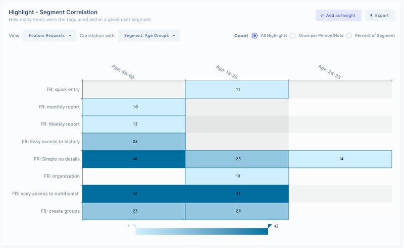
Right away we can see patterns that could be very valuable for our product:
- Older customers seem to really value simplicity
- Easy access to nutritionists seems to have a much broader appeal in terms of age groups.
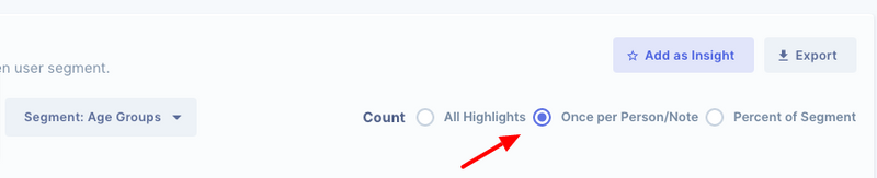
What if I have tagged a participant's note multiple times with the same tag?
By default UserBit counts every single occurrence of a highlight tag which at times we may not want - if we have tagged a participant's content multiple times with the same tag, the chart will show a higher count on that tag even if only one participant mentioned it.
But don't worry, this section allows us to fine-tune the analysis. We can tell UserBit to only count a highlight tag once for each participant.
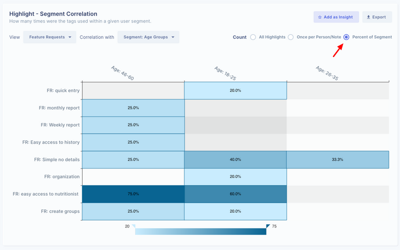
What if I want to see what % of a given segment correlates with this feature request?
Sometimes just seeing the count number hides the real story.
Let's consider an example: Let's say you want to see how age groups correlate with the desire for ice cream. You interview 10 young people and 50 older folks. All 10 said they want ice cream where as 25 of the 50 older folks said they want it. There's a much stronger correlation between younger people and want for ice cream. But if you only looked at the number, you'd think older people want ice cream more than younger folks.
So as you can guess, an important question to ask your data is:
What % of a given segment correlates with a pain-point or feature request?
By looking at percentages we can eliminate selection bias.
Segment Correlation
The second heat map on this screen lets you bubble up relationships between segment tag categories. This can help clarify overlap of various segments in your user base to better understand them. For example, if we wanted to see correlation between the Age Group segments and Technical Awareness in our data.
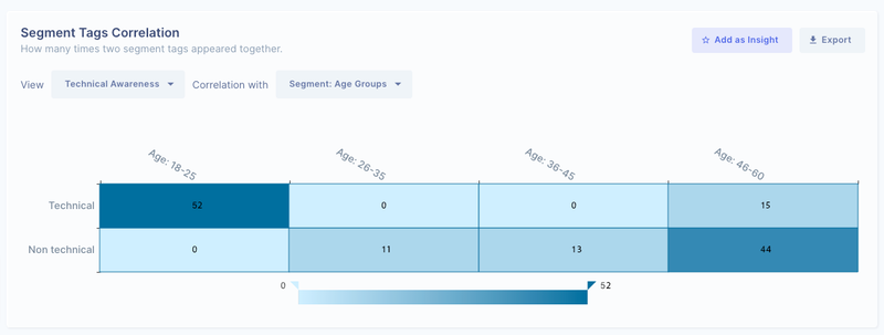
In the above heat map, we can clearly see a pattern emerging. In our user base, technical users tend to be younger while older folks tend to be less technical. As you can imagine, these could quickly give you a base for your user persona archetypes.
Highlight Correlation
Just like segment correlation, another valuable correlation is that between two behavioral tag categories. This correlation helps us get valuable answers to questions like - for people with given pain point, what feature do they request the most? Let's say in our project we had two highlight categories: pain points and feature requests. We could correlate them to answer the question above:
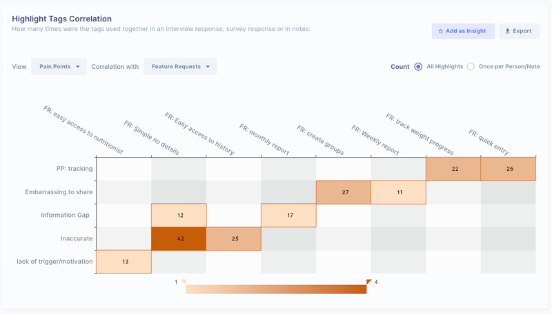
Here, we can quickly identify that inaccuracy is the biggest complain amongst people who also look for simplicity in the app. This gives us a great design opportunity - is app complexity causing confusion for people, making them think it's inaccurate?
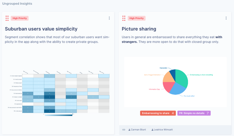
Add as Insight or Export

The goal of analysis is always to extract meaningful insights and design opportunities. UserBit gives you the ability to save these charts as insights or export them out as excel files so you can record and present these insights for the next steps in your UX process.
Hope this guide helps you analyze and synthesize your data quickly so you can contribute to creating meaningful and useful products!