Analyze tag frequencies to discover insights in qualitative data
In this guide we'll go over the frequency chart widget and how you can use them to uncover insights from your qualitative data.
Default charts
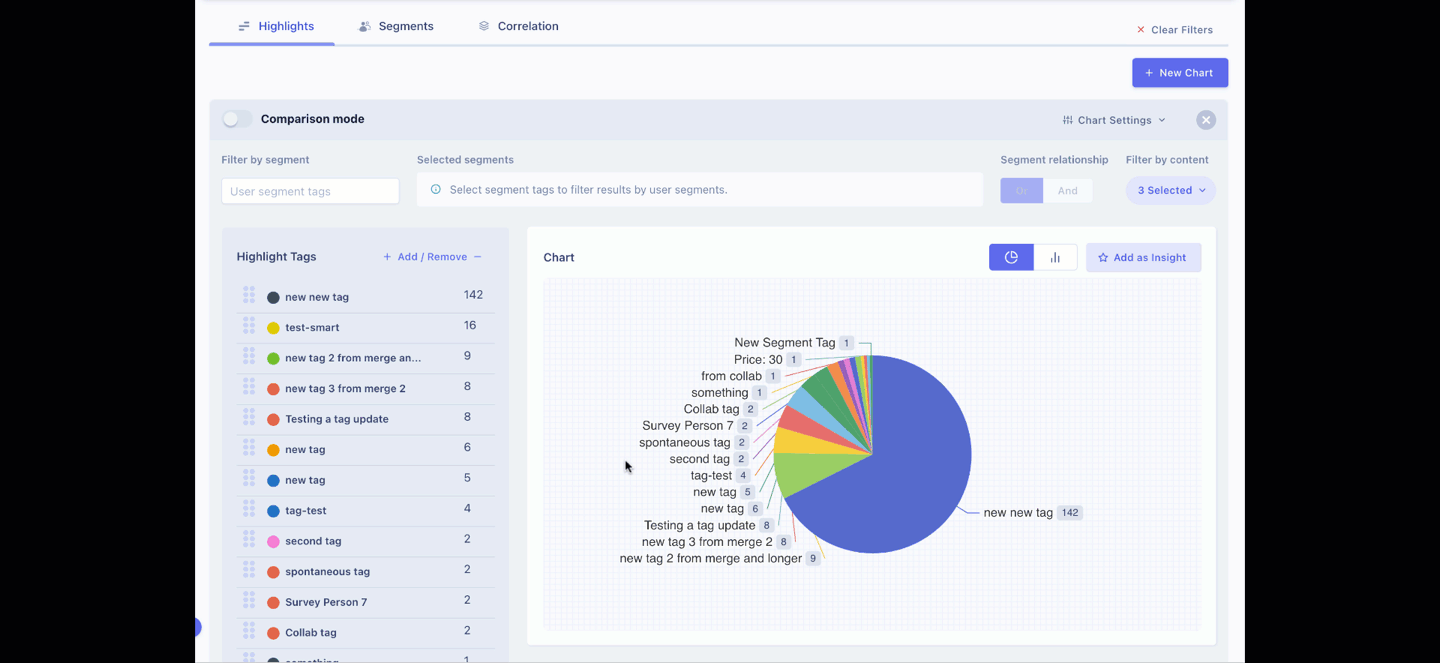
By default the frequency tab within the analytics section wakes up with a chart for every tag category you have within the project along with one for the uncategorized tags.
In addition, you can also create a new chart or remove an existing one at any time.
Note: The changes you make on your charts, including adding/remove charts only last for your current session. When you refresh the browser, you'll see the default charts again.
Manage tag list
Within a chart widget, you have several tools to customize what you want to visualize.
Add / Remove highlight tags from the chart
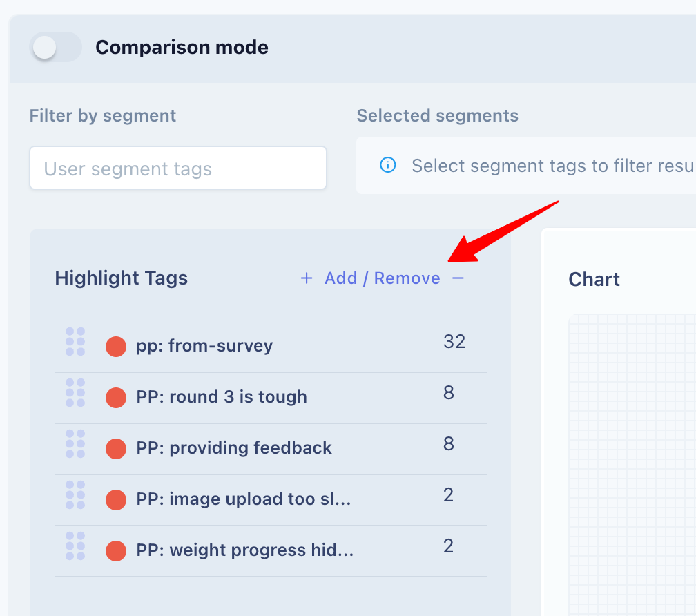
To modify the highlight tag list currently being visualized, Click on the Add / Remove button to launch the tag selector. You can build your list of selected tags here from all highlight tags within your project.
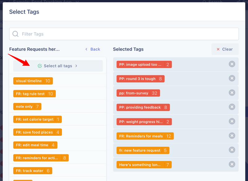
The selector modal allows you to:
- Mix and match tags from various categories.
- Search through tags within the project.
- Select all tags within a category or search result with one click.
Drag and drop to change tag order
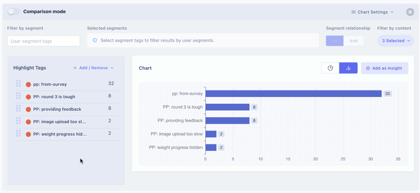
By default, the selected tags in a chart are ordered in descending order with respect to the number of times they have been used. However, you can arrange the tags in any order by dragging the tags in position.
Count tags once per person
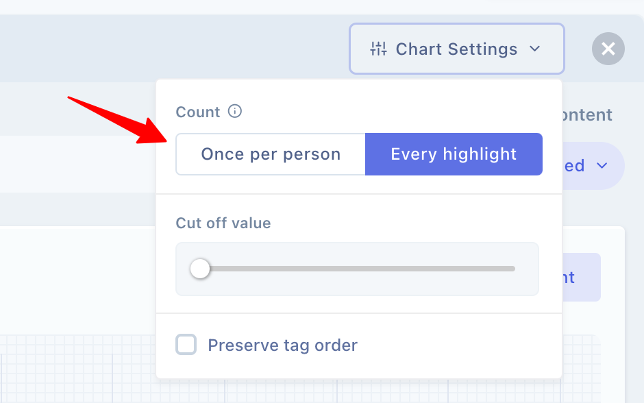
As you might have noticed, the tags contain the count for the number of times they have been used within your project. For analysis while this number is important, sometimes you might want to only count tags once per person. Instead of worrying about not having to use the same tag more than once in an interview or feedback, you can leverage the once per person checkbox.
Cutoff threshold
The cutoff setting allows you to disregard tags that have a count below the value specified. For example, if you have 30 tags in your chart with a count of 1 and you don't want to visualize them in the chart, then you'd set your cutoff to 1.
Filters
To fine-tune your chart visualizations even more, there are several features that you can use.
Filter by segments
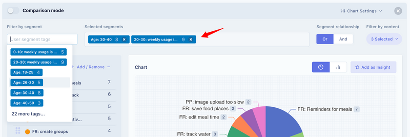
Remember that on UserBit you can create segment tags along with highlight tags. This means that you can now filter your frequency data using user segments. For this, just select the relevant segments from the selector input.
Segment relationship
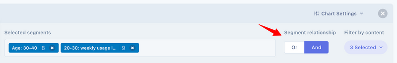
If you filter by multiple segments, the relationship switch allows you to determine how the segments should be combined. For example, if you had two segments - engineers and urban dwellers.
- If you used the and relationship, the analysis would be filtered to show data from participants that are tagged by both 'engineer' tag and 'urban' tag.
- If you used or relationshp, you'd see data from participants that have been tagged with either 'engineer' tag or 'urban' tag.
Filter by content
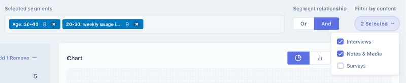
In addition, you can also filter your analysis by content. By default, all content types are selected but you have the option to turn off counts from any type of the content.
- Interviews
- Notes & Media
- Surveys
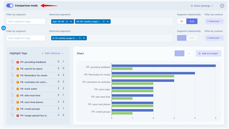
Comparison Mode
The charts also allow you to compare two sets of segments within the same chart. Just turn the Comparison Mode Switch on at the top of the relevant chart. This will enable the second segment filter bar to compare counts from two different sets at once.