User Personas - A Complete Guide for UX Designers
User personas have always had a significant but conflicted place in the user experience ( UX ) design process. On one side of the spectrum, you’ll find product teams that have created personas only to have them lie around collecting dust. However, on the other side, you’ll find researchers who passionately defend their usefulness.
In this article, we'll do a deep dive into personas as a research method. You’ll learn what makes them such effective tools for user-centered design, and how to avoid the pitfalls that result in counterproductive effort for researchers.
What is a user persona?

Before we get into the why and how of things, let's start by defining what a user persona is. Understanding its definition in the context of UX is important because personas aren’t a concept unique to the field of user experience. It's not only a relatively common English word, it also has parallel concepts in fields such as marketing. So, what's a persona in the context of UX?
A user persona is a fictional surrogate user that highlights specific behavioral and demographical characteristics of a group of real target users.
User personas are not marketing personas
Simply put, personas help keep specific archetypes of users in mind during the design process. They represent users who exhibit similar goals, mental models, and attitudes relative to our product.
This concept differs from a marketing persona, which is less specific and focuses on demographics. Marketing personas focus on what messaging will result in more sales, while UX personas emphasize user needs to inform design decisions and product development.
User personas are not averages of our users
Personas are also not averages of demographic variables. For example, let's imagine that our product caters to two groups of users — teens, and retired people. If we designed a persona for the average age group of this user pool (35 years old), it would fail to represent either of our target cohorts.
Being clear about what a persona is not is the first step in creating effective personas in user experience research. Now that we have a good grasp of the definition, let's talk about why we need personas in our UX workflow.
Why are user personas useful?
Okay, so now we know that personas are surrogate users that represent a group or cohort of real users. But why do we need them at all? Why can't we just talk about real users and use them as the measuring stick for our product requirements? We'll answer this question by discussing the several advantages of using personas to inform our UX design.
1. A “user” means different things to different people

If I asked you to think about your product's user, which user would you think of? The last client you talked to? The last person that complained about a feature? Or perhaps the customer that's paying you the most money?
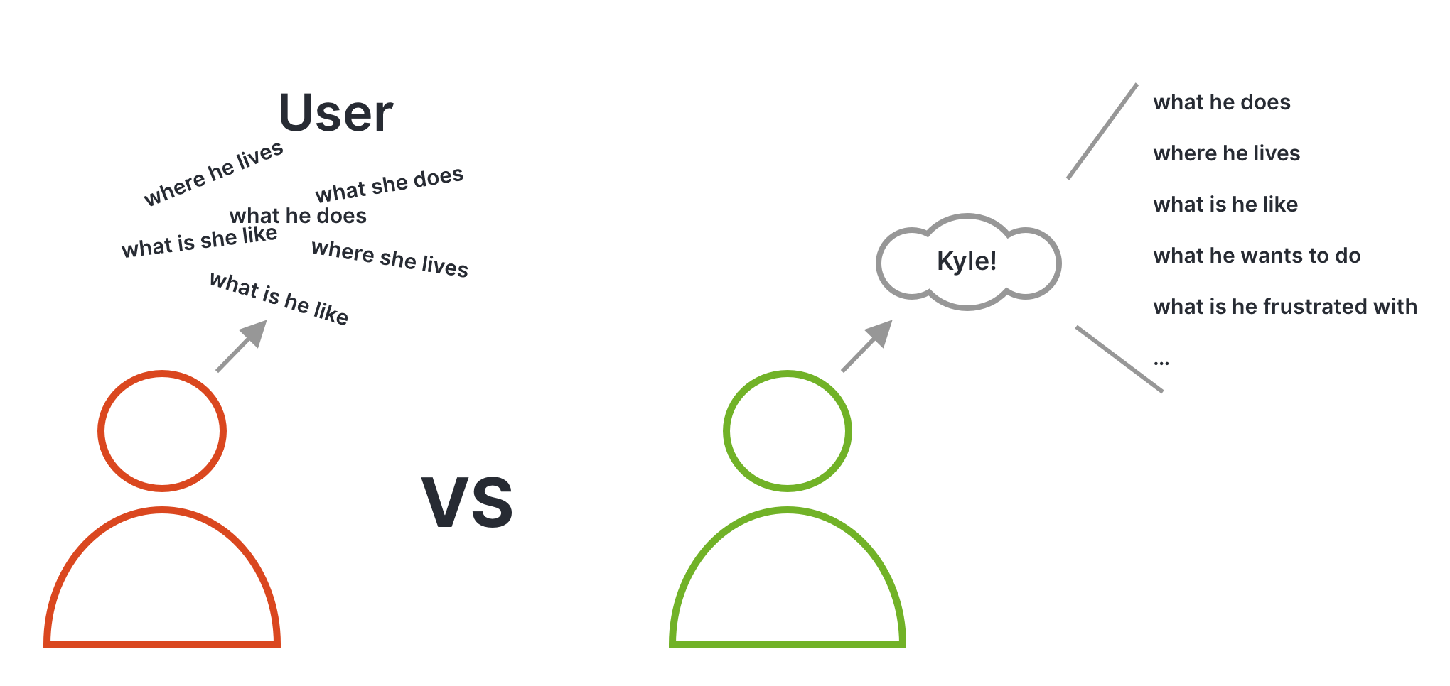
Now, picture, in a meeting with your stakeholders you say something like — "Our users would really appreciate feature X." Every person in that meeting would have their own mental model of the "user." Some would agree with you, while others won't, simply because they're thinking of a different user. This phenomenon is referred to as the elastic user.
An elastic user is a generic user which means different things to different people. Designing for an “elastic user” happens when product decisions are made by different stakeholders who may define the ‘user’ according to their convenience.
Now picture making the same statement but referring to a persona — "Sally, the marketer would really appreciate feature X." Instantly, everyone in the meeting has the same mental model of the user archetype you're talking about. Now the discussion about your statement's validity can be a lot more fruitful and focused.
2. A user persona gives you a memorable shorthand
Generally, human beings aren’t very capable of remembering a list of items, attributes, behaviors, etc. But one thing we've evolved to be good at is remembering other people and their characteristics. Personas encapsulate a personality and its traits behind a face and a name. A concrete representation of a human being is much easier to get lodged in a person's brain than a set of demographical or behavioral data.
So, arguably the most important benefit of a persona is that it gives everyone on the team a common and more precise shorthand for a cohort of your target users.
3. Personas help you avoid designing for yourself
The main difference between artists and designers is that design is for others. However, even the most seasoned designers sometimes fall prey to self-referential design decisions. Some things seem so obvious to us that we fail to see them from anyone else's perspective.
Personas help us stay true to the user-centered part of the design process. We're almost never designing a product for ourselves. Having our target personas constantly in mind as we make design decisions helps us avoid making biased assumptions.
4. Personas help you avoid designing for every use case
The opposite end of the spectrum is what tends to happen when there are no personas. We've all experienced this either at our jobs or as users of other products — Featuritis.
Featuritis: A disease that affects products if individual users and their feedback are left in charge of prioritizing features in our products.
This issue is especially apparent in enterprise applications, like when there are tons of features, buttons, and hidden menu items. Every one of them could potentially be traced back to: "An important user asked for it."
By default, personas represent a cohort of users, so if we're designing with a UX persona in mind, we're never in danger of over-individualizing the product experience.
5. Personas allow for easy transfer of knowledge
Often in our careers as UX professionals, we need to collaborate with an outside agency or get a new hire up to speed. Personas are instrumental in conveying a complex amount of information and answering the "Who are we designing for?" question, relatively easily.
Now that we've convinced you of how personas can boost your product development workflow, let's learn how to create effective ones.
How to create a user persona (with examples)
If you've been in the industry for a few years, you've probably come across articles and resources that talk about the benefits of personas. But few of them actually delve into how we create personas that work.
In the following sections, we'll give you a blueprint for not only the best practices for creating personas but also how to come up with the necessary content.
The anatomy of a UX persona
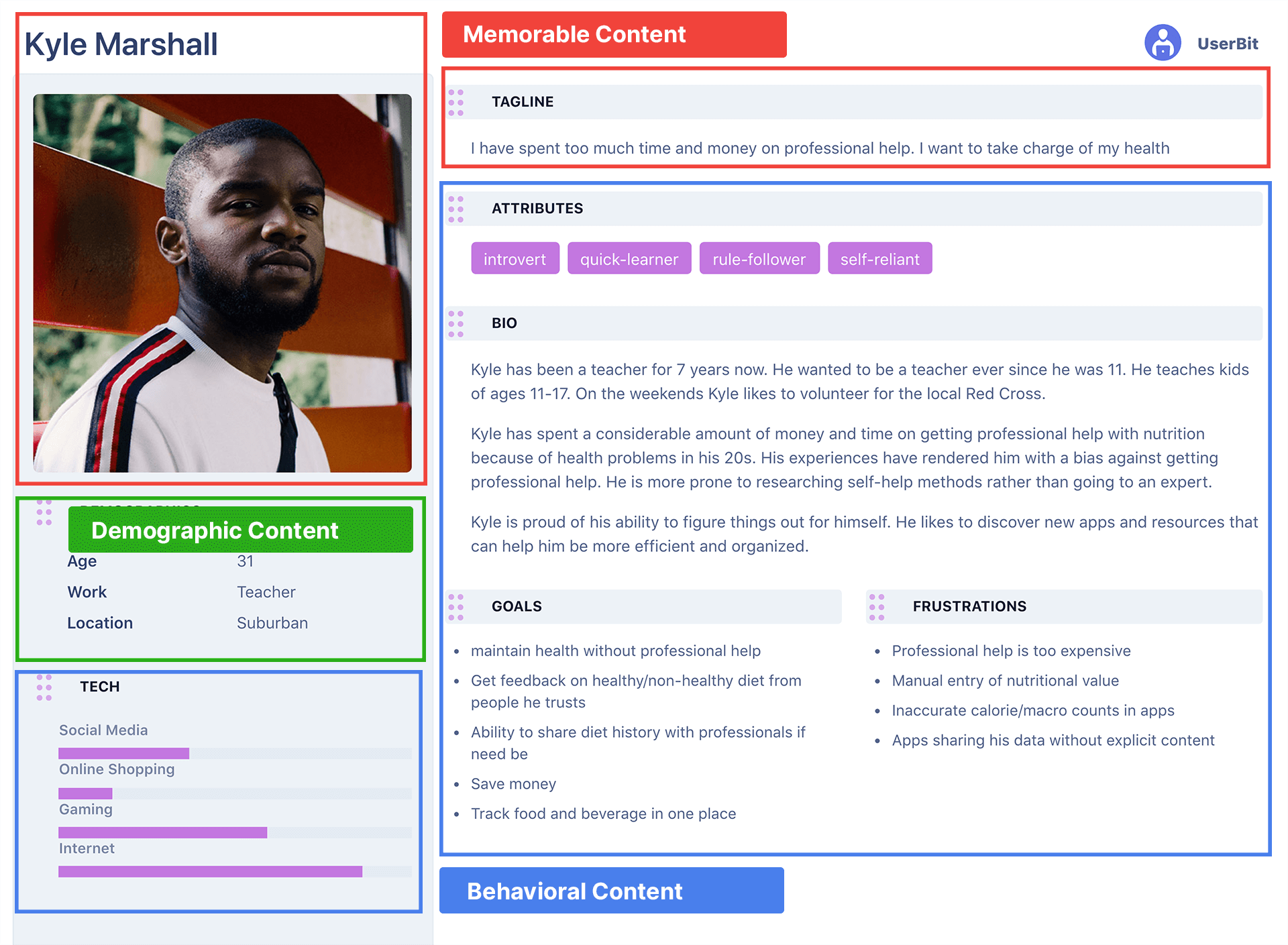
At a fundamental level, a user persona is made of three kinds of content: memorable, demographic, and behavioral. Unfortunately, several of us fail to understand that all these pieces are essential for a persona to work.

1. Memorable content
Memorable content pieces are characteristics of personas that are added to make them easy to recall.
Some examples of memorable content include an image (like a headshot), their name, and a tagline.
2. Demographic content
Demographic content refers to things in a user’s environment or traits that describe them.
When you're tagging your research data, the segment tags we use almost always fall into this category.
Some common examples include the team’s size, health problems, age, role, and where they live.
3. Behavioral content
Behavioral content is related to things that users do, want to do, or are frustrated about doing. During the coding process, these are things that we generally add highlight tags to.
Examples of behavioral content include information such as:
-
"Tacks water along with food"
-
"Embarrassed to share food pictures"
-
"Doesn't care about macros"
-
"Unhappy about the confusing screen"
Coming up with the content for user personas
The first thing to remember when thinking about creating personas is that all personas are based on real data.
This notion means we need to research real users before we can begin developing personas. We need raw data to take demographic and behavioral data from.
So where do we get this raw data? The answer is: user interviews! Yes, there are other passive methods like surveys, feedback repositories, etc. But by far, the best method of getting qualitative data for research is conducting active user interviews.
Here's a rough framework to follow when a new project/feature comes down the pipeline:
-
Step 1: Conduct stakeholder interviews to get clarity on features, constraints, timelines, and so on.
-
Step 2: Set up user interviews to collect data on users and their behavior.
-
Step 3: Synthesize the gathered qualitative data.
You'll find a ton of resources on Step 1 and 2. In this section, we'll dive into Step 3 in more detail — this is the step that you generally won't find many resources for.
What exactly are we doing during synthesis? The goal during synthesis for personas is to identify patterns among our users — both in terms of demographics and behavior. And then, the goal continues with finding overlaps of segment tags and behavioral tags. Let's clarify with examples:
Demographic tags example

In the example above, there are two segment categories — age range and team size. Each tag within the categories represents a demographic range to bucket the users in.
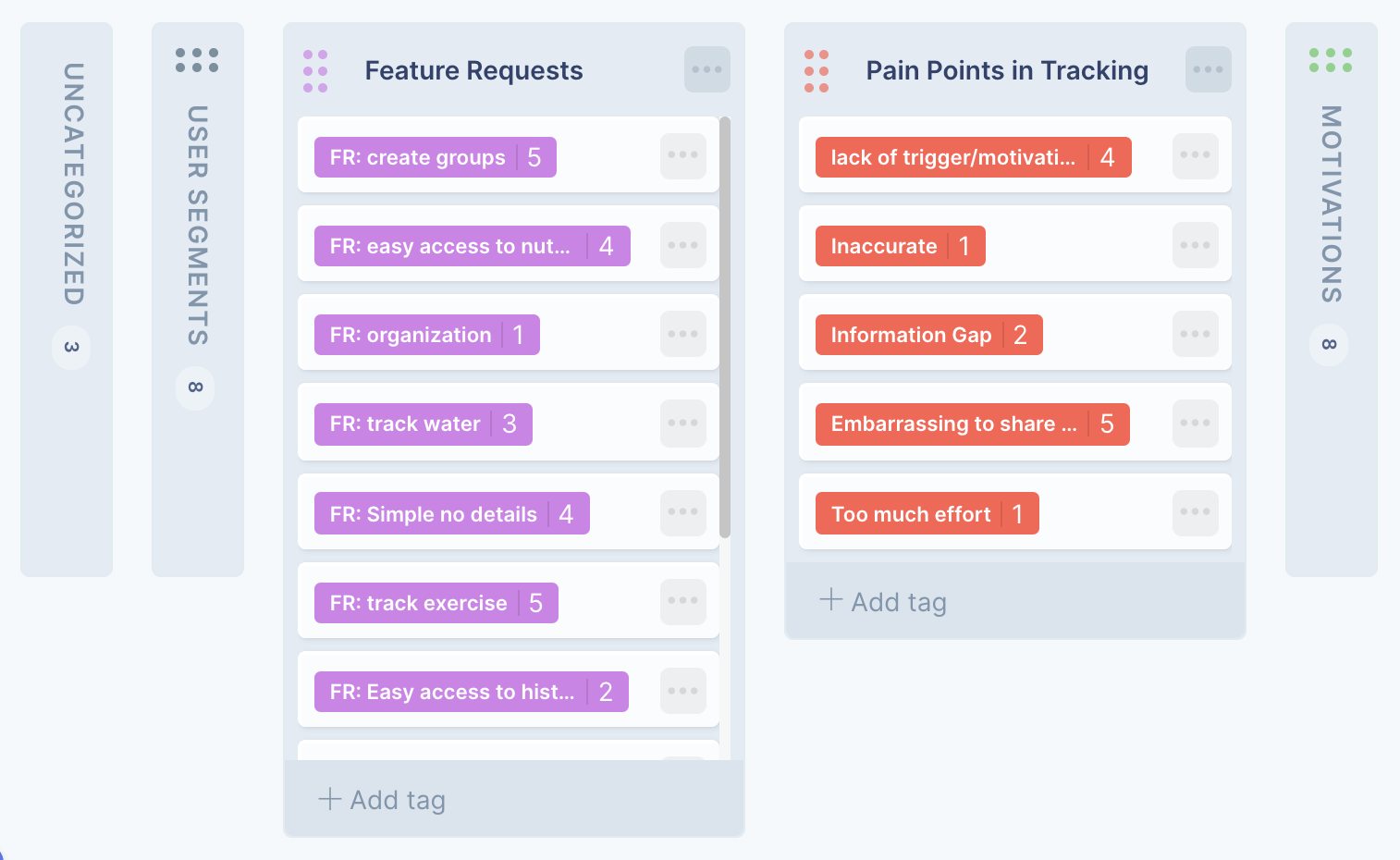
Behavioral tags example

In the behavioral example, the categories shown are pain points and feature requests. By tagging research data with these behavioral tags, we're automatically categorizing them into respective buckets.
The next step is to identify patterns of similarity and differences between users by noting where the majority of users within a segment (age group, team size) have the same behavioral trait (pain points, feature requests, motivations, etc).
We can certainly try to identify these patterns manually or in a spreadsheet, but large amounts of data make this process quite cumbersome. UserBit makes this analysis a breeze by automatically keeping track of tag frequencies. All we have to do is click on the behavioral tag and look at the segment aggregation section:

From our findings, we can clearly see that older suburban users are embarrassed to share pictures of what they eat with strangers. We can discard evenly distributed segment aggregates within the same category. In this case, whether our users are technical or non-technical, they seem to both experience this pain point so persona-wise, that segment category isn't relevant.
Once we've gone through our behavioral tags and collected our findings, we'd have the skeleton for our personas with statements in the following pattern: [Segment combination] - [Behavioral trait].
For example:
-
Older users, suburban: embarrassed to share food with strangers
-
Older user: not concerned about macros
-
Vegetarian, young: wants to track water intake
Now we just have to cluster the statements pertaining to the same segment tags together (sometimes combining a few) and we can flesh out our personas with relevant content.
So far we've covered why personas are important and how to create them. Now let’s talk about when during the product development cycle you should be investing time into creating personas.
When should you make a persona?
"As early as you can" seems to be the ubiquitous response to this question. However, as we've just discussed, personas need to be based on real data from real users. This fact necessitates the gathering of qualitative data via interviews or surveys.
However, you should definitely create personas before any real interaction/visual design work. It just makes those steps so much easier for the reasons mentioned earlier in this article.
Does this mean that if you're in the middle of a project or product development, there's no use of creating personas? No, there are several benefits of having personas even after design work has begun. A common one is for handing over knowledge to new hires or contractors. It makes communicating who we're designing for so much easier than having to describe it via the elastic user.
4 reasons why UX personas fail
Let's circle back and address a statement made at the start of this article. There are countless personas collecting dust in several companies. Why?
The reason has less to do with the effectiveness of personas and more with whether we truly understand how to create or use personas. Here are a few pitfalls we need to avoid when using personas in UX teams.
1. Creating UX personas in a silo
One of the most common reasons for personas failing is that one person is left in charge of them. One individual who does the hard work of research, synthesis, creation, and socialization. For a persona to be useful, every member of the UX team (at the very least) needs to be involved during its creation.
Why? Because the team needs to see that the persona is coming from real data from real users. Believing in personas is essential to their efficacy and a team that thinks they’re imaginary just won't have the necessary conviction.
2. Creating user personas without enough research
There's a reason this point has been repeated multiple times in this article. Time and again we've seen teams begin their process by creating personas based on their mental model or their stakeholders' mental models.
This method just doesn't work. Personas need to be based on real users and their environment. Designing for imaginary users will result in products only imaginary users would want.
3. Adding too much clutter
The point of a persona isn't to make it an encyclopedia of information. Remember that for personas to work, they need to be memorable. Only information relevant to the business use case should make it into the one-page persona. If the content isn't able to fit within a standard A4 paper, it's time to evaluate whether all that data is needed. Personas are living documents and they evolve, but care should be taken to keep them short and relevant.
In the same line of thinking, a persona is also not an art project. Adding too many images and beautifying a persona isn't going to make it more effective.
4. Lacking an understanding of personas as a UX research method
Let's face it, UX is a vast evolving field and there are so many topics we need to be well-versed in that we're bound to skim over some. A lot of us (I was one) think we have a good understanding of personas and how to create them because we're familiar with the word "persona."
Personas are also used in other fields where their purpose and positioning are different than in UX, adding to the confusion. We've learned the hard way that in UX research, when it comes to synthesizing good data, “winging it” never really works. Personas require proper study, practice, and understanding to be effective.
Conclusion
Congratulations on making it to the end! We've gone through what a persona is, why they’re useful in UX research, how to create effective personas, and also, some of the common reasons they fail.
I hope there's enough here to get you started on personas the right way. It takes study and practice, but once it's integrated into the design process, personas not only have the potential to streamline but also make the process a lot more user-centric.
And remember, to help you create your personas by making UserBit is always here to make it fast and easy to organize and analyze your qualitative research data.


