
How to do a Meaningful UX Audit in 6 Steps
UX audits tend to be one of those tasks that teams either postpone or rush through. But when done right, they can reveal exactly where your product is helping users — and where it’s getting in their way
A UX audit is your chance to examine how users are experiencing your product. If your users are encountering dead ends or struggling to find what they need, this is the time to fix them.
Let’s break it down into manageable steps to ensure you get actionable and meaningful results.
1. Define your audit goals
Before diving in, clarify what you want to achieve with your audit. Are you focusing on improving user flows or identifying gaps in accessibility, for example?
Clear objectives will keep your audit focused and help you measure its success. If your goal is to reduce drop-offs during the signup process, you can measure success by tracking changes in completion rates after implementing audit-driven improvements.
Goals set the foundation for every other step in your audit. For example, a goal like "improve onboarding completion rates" focuses your analysis on areas that directly affect new users. With clear objectives, your team avoids aimless digging and instead hones in on actionable insights.
To sharpen your goals, consider using frameworks like empathy mapping. This technique helps you understand what users think, feel, and experience, making it easier to pinpoint their needs and frustrations.
Affinity mapping is another powerful tool, especially when collaborating with a team. By grouping related user feedback or issues into clusters, you can uncover recurring themes and prioritize goals accordingly.
Here’s another tip: If you are working with multiple clients, when working across multiple audits or teams, separating goals into dedicated workspaces can help keep insights focused and stakeholders aligned.
2. Gather and organize data
Data is the backbone of any UX audit, and it typically comes from a range of sources, such as user interviews, analytics, usability tests, and customer feedback.
Without a system to manage this influx, it’s easy to feel overwhelmed, and a lack of organization can lead to missed insights. That’s why it’s essential to organize your data efficiently. Doing so allows you to focus on identifying meaningful patterns instead of untangling raw information.
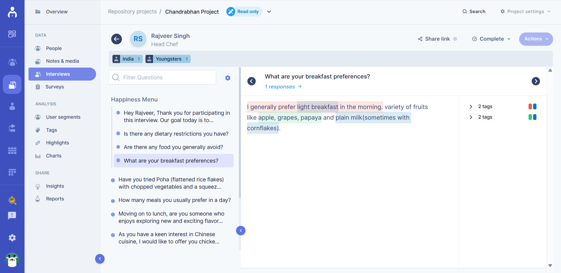
Let’s say you’re running interviews and transcribing them into text. Tagging the feedback for common themes like pain points or feature requests will speed up analysis and also ensure you don’t miss critical patterns. Organized data allows you to efficiently identify patterns and connections that might otherwise get lost in the noise.
Also, storing all your data in a centralized location — whether it’s a workspace, spreadsheet, or platform like UserBit — can help avoid duplication and streamline collaboration.
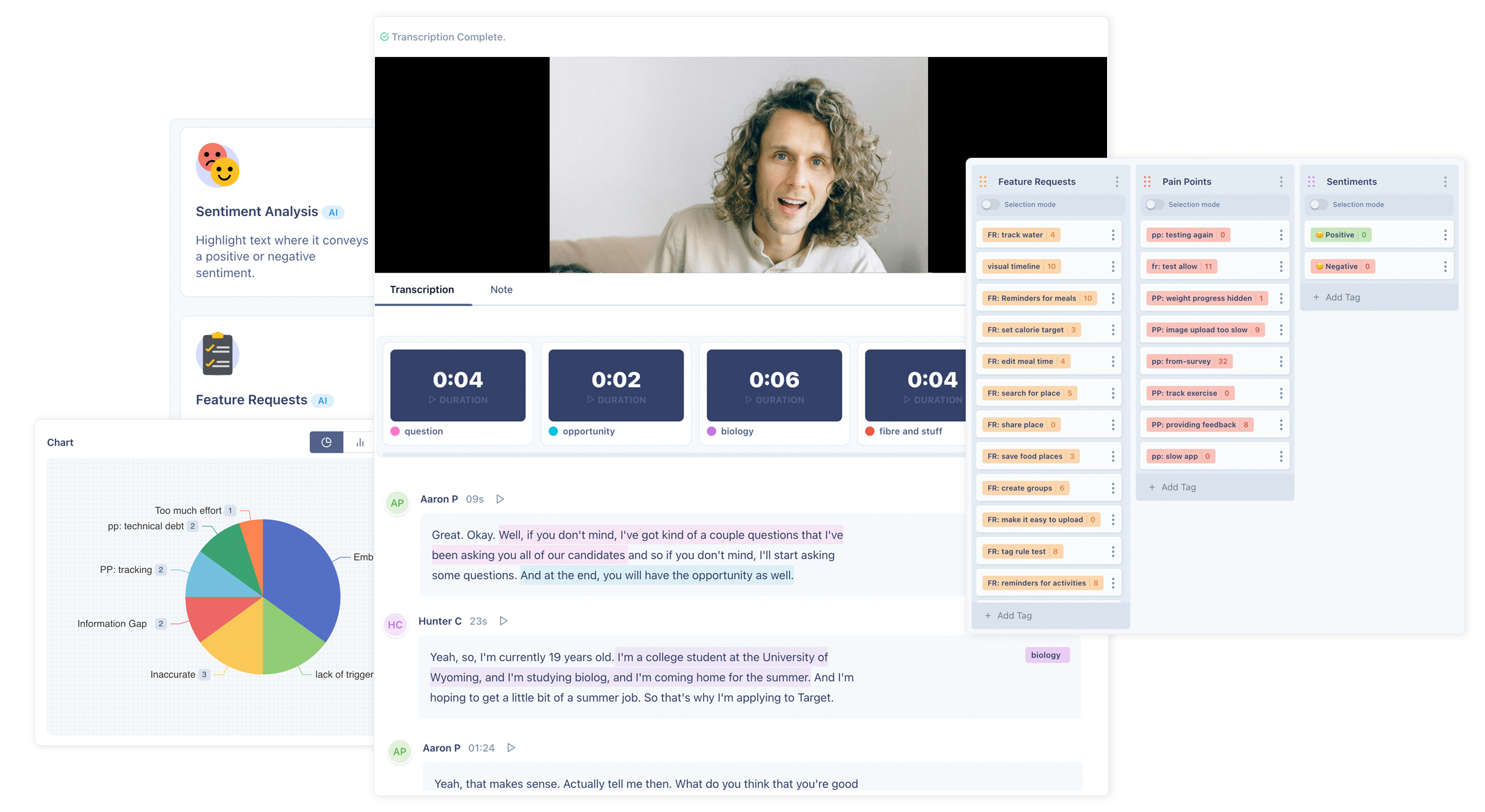
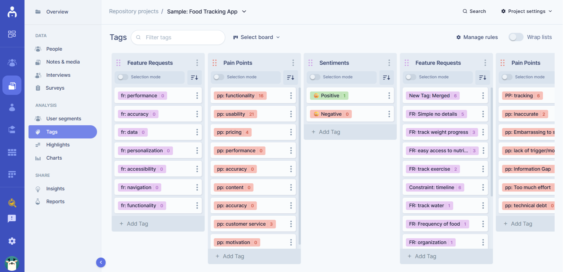
It’s also helpful to segment your data into clear categories, such as user personas, task flows, or feature-specific insights. Segmenting allows you to understand how different groups of users interact with your product and highlights the unique challenges they face.
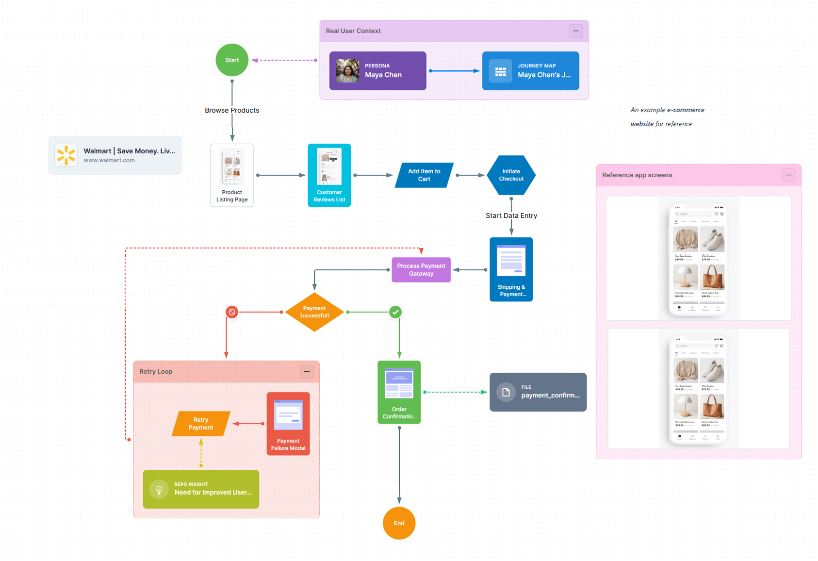
You might also overlay your findings onto a user journey map, which provides a visual representation of how feedback relates to each stage of the user experience, so you can see what issues came up and what improvements are most needed.
To prioritize your findings, consider creating a prioritization matrix that ranks issues by their impact and effort. Focusing first on high-impact, low-effort problems ensures that your recommendations lead to meaningful changes without overwhelming your team.
3. Analyze user flows
When conducting a UX audit, you’ll need a better grasp of how users navigate it and where they encounter challenges. Are users abandoning tasks midway? Are specific steps taking too long? Mapping out user journeys helps you identify these pain points and determine where users struggle.
For example, analytics might show a high drop-off rate during checkout. Visualizing this flow could reveal issues like unclear payment options or unexpected costs, which confuse users and lead them to abandon their carts. Similarly, a multi-step form without progress indicators can leave users frustrated because they don’t know how close they are to finishing. Fixing these issues with clearer options, fewer steps, or progress bars can reduce frustration and improve completion rates.
You can gain even more insights by conducting usability tests where you observe real users interacting with your product. Watching users struggle in real time can reveal problems that analytics might miss. Additionally, tools like heat maps can show where users click, hesitate, or drop off, helping you pinpoint problem areas in your interface.
It’s also helpful to break down user flows by different groups or scenarios. For instance, new users might struggle with onboarding tasks that returning users find intuitive. Imagine a sign-up process for a SaaS platform: a new user might encounter confusion when asked to select a subscription plan during onboarding because they haven’t yet explored the product. By contrast, returning users who are already familiar with the platform might navigate the same process with ease.
Similarly, mobile users might face challenges that are unique to their context, such as difficulty completing a multi-step form on a smaller screen. Maybe your checkout process requires users to input shipping and payment details across multiple pages. On mobile, users might drop off because the text fields are too small, the buttons are hard to tap, or the process feels too lengthy compared to desktop. These usability issues could be resolved by designing a simplified one-page checkout for mobile, prioritizing autofill options, or reducing the number of required fields.
By analyzing these differences, you can create tailored solutions for specific user groups. For new users, you might offer a free trial or walkthrough to familiarize them with the product before asking them to choose a plan. For mobile users, you could optimize interactions to require fewer taps and ensure key elements like buttons and text fields are designed for smaller screens. Addressing these specific challenges ensures your product works seamlessly across diverse user scenarios and devices.
4. Assess your product’s information architecture
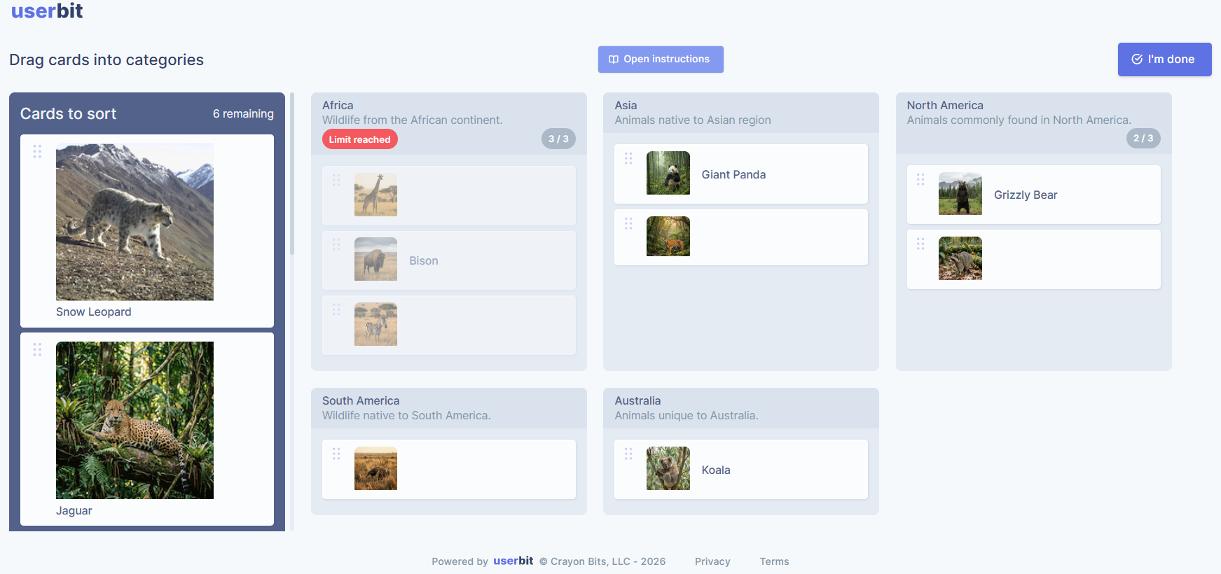
Information architecture (IA) is the backbone of your site or app’s usability. If users can’t find what they’re looking for, it doesn’t matter how great your content or design is — they’ll bounce. To make sure your IA aligns with user expectations, you can use methods like card sorting, tree testing, and even site maps.
Start with card sorting to understand how users naturally group content. For example, if you’re running a jewelry site, users might group “Sale Items” with “Accessories” instead of “Main Collection.” This insight can help you structure your navigation in a way that makes sense to your audience.
Tree testing lets you test your existing structure — imagine users consistently failing to locate "Order History" under "Profile." That signals a need to relabel or reposition the menu item.
Here’s a pro tip: before diving into these methods, create or refine a visual site map so you can see how pages are connected and whether key content is buried too deep.
By comparing your site map with user feedback from card sorting or tree testing, you can identify problem areas quickly. For example, if the site map reveals that important pages like “Support” are three clicks deep, you might need to move them closer to the top-level navigation.
Site maps are also great for stakeholder alignment. When everyone sees the structure laid out visually, it’s easier to discuss changes and avoid confusion. Tools like UserBit or even a simple flowchart app can make creating a site map quick and painless.
By combining insights from card sorting, tree testing, and site maps, you’ll ensure your IA aligns with user expectations and reduces navigation frustration. Remember, a little restructuring can go a long way in improving the overall user experience.
5. Evaluate visual and interaction design
Think of this step as your quality check. How does your product feel to use? Take a long, hard look. Are the visuals helping or hurting usability? Start by testing the basics: can users easily find buttons, read text, and navigate smoothly?
Think of a sign-up page with tiny text and low-contrast colors. Users might struggle to even find the fields, let alone complete the form. Or picture a loading animation that takes so long users think the app is frozen — it’s these small design missteps that frustrate users and make your product feel unpolished.
Dig into the details. Check for consistency across your interface — are button styles, fonts, and colors uniform? Also, evaluate accessibility: is your site readable for users with visual impairments or disabilities? Tools like contrast checkers and accessibility plug-ins can help you spot and document issues.
The key here is to create a clear list of what’s working and what isn’t. Document the hiccups, whether it’s a confusing button label or a form that feels clunky, so you’re ready to turn them into action items in Step 6.
6. Create actionable recommendations
Here’s the final thing about a UX audit: finding problems is only half the battle. If you can’t translate those problems into actionable solutions, you’re leaving your team hanging.
Let’s say you notice users are bailing on a multi-step form. Instead of just saying, “Fix the form,” you could recommend combining steps, adding a progress bar, or even trimming unnecessary fields. For example, if your form asks for a user’s home address just to send an email confirmation, cut it. Make every field count.
And don’t stop there. Bring the receipts. If heatmaps show users are clicking on a non-clickable image, pair that data with a suggestion to make the image a button or add a caption explaining it. If usability testing reveals users are confused by vague labels, suggest replacements that match what users expect. For example, change “Profile Preferences” to something clearer like “Account Settings.”
When you present these recommendations, make them impossible to ignore. Use screenshots, graphs, or even short video clips to show the issue and how your solution fixes it. A “before-and-after” can work wonders for getting buy-in from stakeholders. The more specific and visual you are, the easier it’ll be to rally everyone around your suggestions.
Conclusion
A UX audit doesn’t have to be a headache. It goes back to purposefully stepping into the users’ shoes for a period of time, seeing where they’re getting stuck, and making small but meaningful tweaks. Breaking it into simple steps, like setting clear goals, organizing your data, and spotting design hiccups, keeps the process manageable and impactful.
If it still feels a bit messy, UserBit’s tools can help you stay on top of things, from tagging feedback to mapping user flows. With a clear plan and a little help, your audit can make a huge difference for your users and your product.
