What Are User Pain Points? - UX Terms to Know
Pain points in UX are problems that users face when they use a website or an app. Spotting these problems and finding ways to fix them can make using a site or app much easier and more enjoyable.
Our product manager, Dani breaks down exactly what UX pain points are in this short, informative video:
4 types of user pain points
Alright, let's explore different types of user pain points, giving you a clear understanding with examples:
1. Functional pain points: These pain points arise from issues with the core functionality of a product or service. Essentially, something isn't working as it should.
-
Slow loading times: Imagine trying to browse an e-commerce site, but each page takes ages to load. This delay leads to frustration, and users abandon their shopping.
-
Broken features: A social media app's "upload image" button suddenly stops working. Users can't share their content, rendering a core function useless.
-
Confusing navigation: A website's menu structure is illogical, making it difficult to find specific information. For example, the "Contact Us" page is hidden under a vague "Support" section.
2. Financial pain points: These pain points relate to users' concerns about cost, value, and financial transactions.
-
Hidden fees: An airline website advertises a low base fare, but during checkout, numerous unexpected fees are added, making the total cost much higher.
-
Lack of price transparency: A subscription service doesn't clearly state its pricing tiers or cancellation policies, leading to confusion and mistrust.
-
Complicated payment processes: An online store's checkout process requires multiple steps and complex forms, making it difficult to complete a purchase.
3. Support pain points: These pain points stem from inadequate customer service or difficulty in getting assistance.
-
Unresponsive customer service: A user sends an email to a company's support team but receives no response for days.
-
Inaccessible support channels: The company only offers phone support during limited hours, making it difficult for users in different time zones to get help.
-
Generic or unhelpful responses: A chatbot provides vague or irrelevant answers to user inquiries, failing to resolve their issues.
4. Process pain points: These pain points arise from inefficient or overly complex workflows.
-
Lengthy registration forms: A website requires users to fill out an extensive registration form with unnecessary fields, discouraging them from signing up.
-
Complicated checkout processes: An e-commerce site's checkout process involves multiple steps, confusing options, and unnecessary prompts, leading to cart abandonment.
-
Difficult data entry: A mobile app's form fields are too small or poorly designed, making it difficult for users to enter information accurately.
A real life pain point example
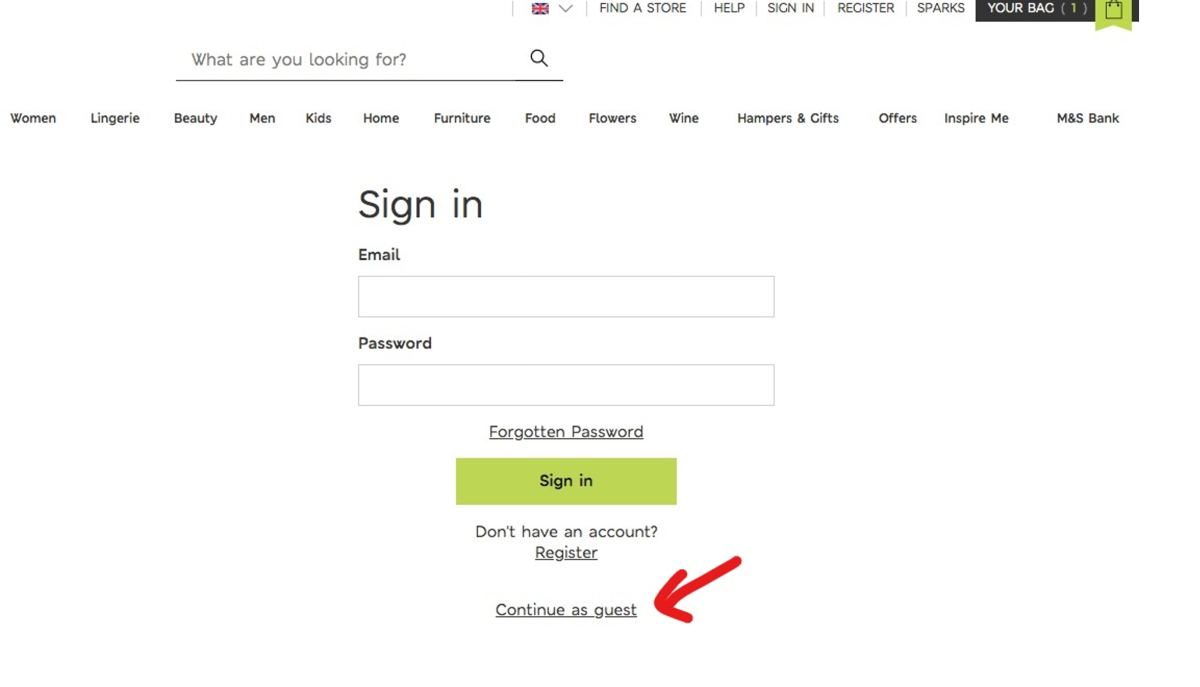
Let's look at an example of a real-life user pain point. You're shopping online late at night. You pick what you want and go to check out. Suddenly, the site tells you to create an account.
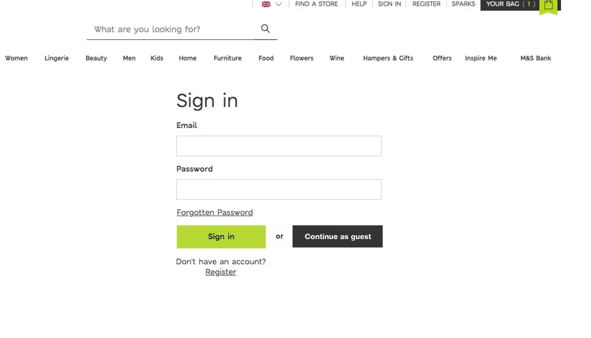
That’s great, but what if you don't want to make an account? You look for the guest checkout option, but have a tough time looking for it because it's in tiny text under the login button.

Struggling to find the next option is a pain point and increases a user’s cognitive load, which nobody wants! The hard-to-find, poorly signified guest checkout option slows down your shopping and makes you think twice about buying anything. Now you might be thinking, “Maybe I didn't need that funky pencil sharpener that looks like a carrot peeler.”
Now, what’s the opposite of pain points in UX?
Let’s call them solutions. They’re the parts of a site or app that may have had issues before, but now make users happy because they work well.
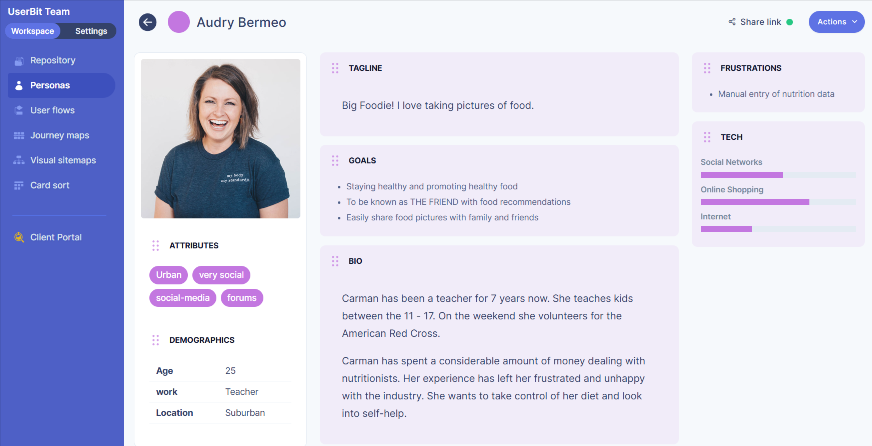
Identifying pain points and their solutions is a big part of user-centered design. Through techniques like creating user personas or taking usability heuristics into consideration, UX researchers and designers can start to build a mental model of users' experiences and identify what might frustrate them.
Creating solid wireframes and prototypes can help visualize these pain points too, by offering an early opportunity to address them.
Asking good questions during user research can also help find pain points, like "What part of the website frustrates you?" or "What made the checkout hard?"
Reducing pain points in UX is an ongoing process of minimizing design debt and ensuring inclusive design. When designers map out these issues, they can see where users might run into problems. After understanding which pain points to focus on, designers and engineers can then work together to make the site or app better.
The goal is always to make things easy and efficient for the user. When we get rid of pain points in the user experience, users have a better time and are more likely to come back.
By finding and fixing these issues through atomic research and collaborating with stakeholders, we can make sure users enjoy their experience.

The concept of addressing pain points is what UX is all about - making sure that users don't hit any snags and that they find what they're looking for quickly and easily. And in the end, maybe that late-night shopper will buy that quirky pencil sharpener after all!
How do we find these pain points?
Identifying user pain points requires a combination of qualitative and quantitative research methods. User interviews provide in-depth insights into user experiences, while usability testing allows us to observe user interactions in real-time.

Surveys and feedback forms gather direct user feedback, and analytics reveal patterns in user behavior. Heatmaps and session recordings visualize user interactions, highlighting areas of struggle, and social media monitoring provides a glimpse into public sentiment.
And how do we fix 'em?
Once identified, pain points require strategic solutions. We prioritize issues based on their severity and impact, develop solutions informed by user feedback, and continuously monitor the results.
A/B testing allows us to compare different solutions, and ongoing feedback ensures we're meeting user needs. We track key metrics, such as conversion rates and customer satisfaction scores, to measure the effectiveness of our efforts.
Accessibility is a crucial aspect of addressing user pain points. We must ensure that our digital products are usable by everyone, including individuals with disabilities. This involves adhering to accessibility guidelines, such as providing alternative text for images, ensuring sufficient color contrast, and making content accessible to screen readers. Creating an inclusive experience not only addresses potential pain points but also expands our user base.
Good UX is all about solutions
User-centered design is fundamental to addressing pain points. We employ techniques like creating user personas and prototypes, and asking insightful questions during user research.

Collaboration between designers and engineers is essential for implementing effective solutions. We strive to minimize design debt and ensure inclusive design, continuously improving the user experience through iterative processes.
Wrapping it up
Ultimately, User Experience is about creating seamless and enjoyable interactions. By identifying and addressing user pain points, we ensure that users can achieve their goals efficiently and effectively. This commitment to user-centered design fosters customer loyalty and drives business success. And perhaps, with these improvements, that late-night shopper will finally purchase their quirky pencil sharpener, enjoying a frustration-free experience.

