What is Design Debt in UX?
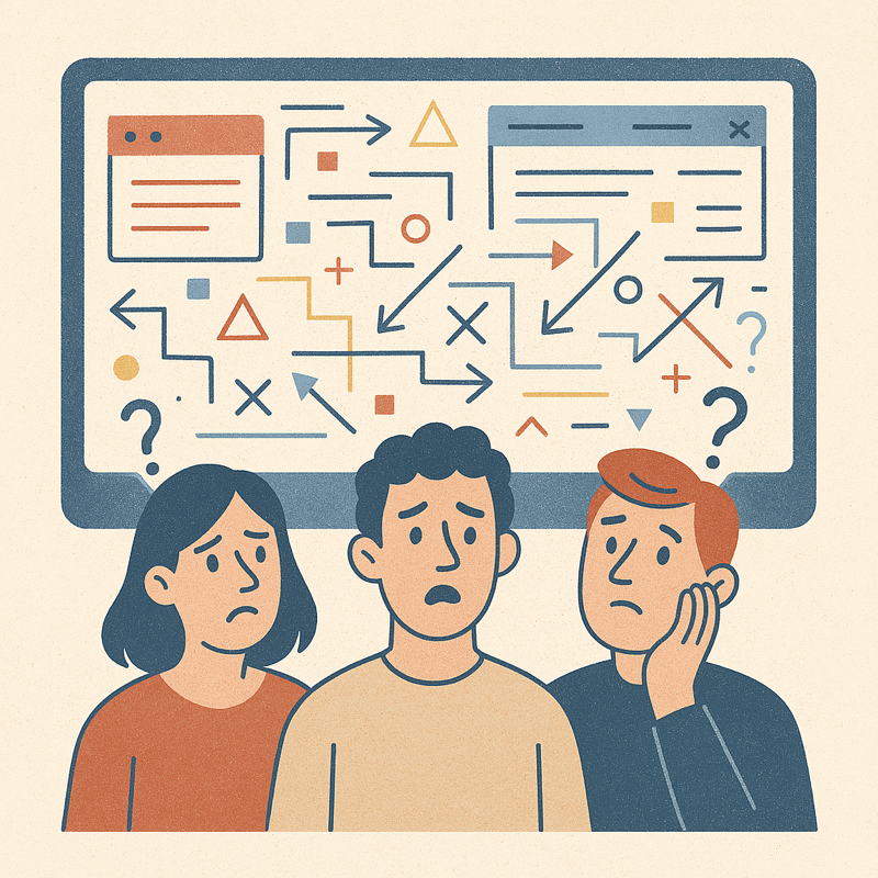
If you've ever used a website or app that felt difficult to navigate and seemed outdated or inconsistent, then these could be signs of design debt.
Think of design debt as a cluttered closet that gets harder to clean the longer you put it off.
It happens when design decisions are made without enough research or when design elements are inconsistent. When design debt builds up, it might get harder to introduce new updates to a product, and you might reduce user satisfaction.
Design debt is similar to the term technical debt in software development, but it's more subjective and harder to detect. Technical debt is the implied cost incurred when businesses don’t fix problems that will affect them in the future. It’s like the leaky pipes in your home that need fixing — it's expensive to maintain over time if not addressed early on. Design debt, on the other hand, is about the user experience and how it evolves over time. A big difference is that design debt is more subjective and harder to detect than technical debt, as it relates to the user experience rather than the underlying code.
An example of design debt
Imagine releasing a mobile app without properly testing it for usability. Users find it difficult to navigate and leave negative reviews.

Then, you decide to add new features to the app without addressing the existing issues, and the app becomes even more cluttered and confusing. You’ve now accumulated design debt, and it’ll take a lot of effort to fix the usability issues and make the app more user-friendly.
How does design debt accumulate?
Design debt doesn't happen overnight — it builds up gradually due to various factors. Here are some common causes:
-
Inconsistent UI elements – When teams use multiple styles, fonts, or layouts without a unified design system, inconsistencies pile up, leading to a fragmented experience.
-
Lack of user research – Skipping usability testing or research to speed up development often results in a product that doesn’t truly address user needs.
-
Quick fixes over long-term solutions – Temporary workarounds may solve immediate problems but create bigger issues later, requiring more effort to fix.
-
Scaling without refining – As products grow, new features are added without revisiting old ones, leading to a patchwork of designs that don’t work well together.
The impact of design debt on UX
Design debt, much like technical debt, is the accumulated cost of making quick, short-term design decisions instead of investing in well-thought-out, long-term solutions. While these shortcuts might seem efficient at the moment, they eventually lead to a messy, inconsistent, and frustrating user experience (U😆. Let's break down the impact of design debt on UX in detail:
1. Inconsistent user interface (UI):
-
Problem: When design debt accumulates, it often results in a patchwork UI. You'll find different button styles, inconsistent typography, varying spacing, and conflicting interaction patterns throughout the product. This lack of uniformity confuses users.
-
Impact: Users struggle to learn the interface because it keeps changing. They have to relearn basic interactions in different sections, leading to frustration and a sense of disorientation. It erodes trust in the product's quality and professionalism.
2. Confusing navigation and information architecture:
-
Problem: Quick fixes and feature additions without a clear plan can create a tangled web of navigation. Users struggle to find what they're looking for because the information architecture is poorly organized or illogical.
-
Impact: Users get lost, abandon tasks, and feel overwhelmed. They may perceive the product as complex and difficult to use, even if the underlying functionality is simple. This can lead to decreased engagement and user satisfaction.
3. Reduced usability and efficiency:
-
Problem: Design debt often leads to clunky workflows and inefficient interactions. Shortcuts may prioritize speed of development over ease of use. For example, adding features without considering the overall user journey can create unnecessary steps.
-
Impact: Users spend more time completing tasks than they should. They may make errors due to confusing interfaces or unclear instructions. This reduces productivity and increases frustration, leading to a negative perception of the product.
4. Increased cognitive load:
-
Problem: Inconsistent design and convoluted navigation force users to expend more mental effort to understand and use the product. They have to constantly figure out how things work, rather than focusing on their goals.
-
Impact: This cognitive overload leads to fatigue and frustration. Users feel mentally drained and less likely to engage with the product for extended periods. It can also lead to errors and decreased comprehension.
5. Diminished accessibility:
-
Problem: Design debt often overlooks accessibility considerations. Shortcuts may involve using low-contrast colors, small font sizes, or interactions that are difficult for users with disabilities.
-
Impact: This creates barriers for users with visual, auditory, motor, or cognitive impairments. It excludes a significant portion of the potential user base and can lead to legal and ethical issues.
6. Higher maintenance costs:
-
Problem: As design debt grows, it becomes increasingly difficult and expensive to maintain and update the product. Fixing inconsistencies and improving usability requires significant redesign and redevelopment.
-
Impact: This increases development costs and slows down the release of new features. It also makes it harder to adapt to changing user needs and market demands.
7. Negative brand perception:
-
Problem: A poorly designed product reflects negatively on the brand. Users associate the product's usability issues with the company's overall quality and professionalism.
-
Impact: This can damage the brand's reputation and erode customer trust. Users are less likely to recommend the product or engage with other offerings from the same company.
8. Decreased user retention and conversion:
-
Problem: Frustrated users are more likely to abandon the product and switch to competitors. Design debt contributes to a negative user experience, which directly impacts user retention and conversion rates.
-
Impact: This can lead to lost revenue and a decline in market share.
How to manage and reduce design debt

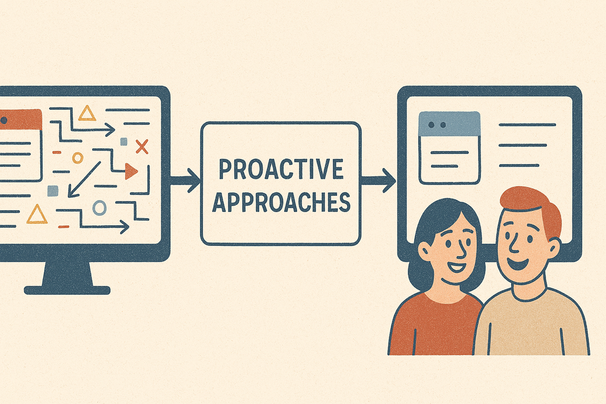
The good news? Design debt can be controlled with a proactive approach. Here’s how:
-
Establish a design system – A well-documented design system ensures consistency across all UI elements.
-
Prioritize user research – Conduct usability testing regularly to identify pain points before they escalate.
-
Refactor UI components – Just like code refactoring, revisit and refine design elements that no longer serve users effectively.
-
Document design decisions – Keeping track of why certain design choices were made helps future teams maintain consistency.
-
Balance speed and quality – While fast iterations are important, always set aside time to refine usability and accessibility.
Final thoughts
In summary, design debt is the accumulated imperfections in the user experience that arise over time as a result of insufficient research, feedback, or consistency. It can lead to slower development, reduced user satisfaction, and increased costs in the long term.
So, try not to rack up that design debt so you can maintain a high-quality user experience.

