Understanding Gestalt Principles in UX Design & Research
What are Gestalt principles?
Gestalt principles in design, often referred to as “Gestalt principles of perception” or simply “Gestalt principles”, act as the "laws of perception" that are helpful for creating user-friendly interfaces.
Here’s a quick video explaining what Gestalt principles are:
Originating from the German word, "Gestalt," which translates to “unified whole,” these principles help us understand the way our brains innately organize visual elements, forming them into groups and meaningful patterns.
Essentially, our cognitive processes “inform” what our eyes see by interpreting a series of individual elements as one cohesive entity.
What are the main Gestalt design principles in UX?
Let’s explore the key Gestalt principles and their applications in the realm of user experience design and research:
1. Similarity principle
In UX design, buttons with similar styles on a UI often signify similar functions or groups.
For example, a suite of editing tools (cut, copy, paste) might all be presented in the same color or shape, helping your end users reduce cognitive load by recognizing patterns more easily.
2. Continuity principle
When designing a multi-step process, like checkout flows in e-commerce, UX designers employ a sense of continuity.
For example, a linear progression represented by breadcrumbs or step numbers can maintain your user's mental model and reduce confusion.
3. Closure principle
Icons in UI often rely on the closure principle.
For example, a trashcan icon might not depict every detail of a real trash can, yet users complete the image in their minds, understanding its affordance. This principle helps to minimize cognitive load and streamline UI elements.
4. Proximity principle
Grouping related fields together in forms, such as all address-related inputs, leverages the proximity principle.
This way of thinking helps users quickly understand the information clusters, promoting efficient feedback loops.
5. Figure/ground principle
Wireframes and prototypes employ this principle.
By highlighting the most important elements (figure) against a more subdued background (ground), designers can direct users' attention and ensure primary actions are clear.
6. Symmetry and order principle
Balanced and symmetrical layouts in UI help in reducing design debt.
For instance, a minimal viable product (MVP) might be presented with a symmetrical UI to ensure a sense of harmony and professionalism for stakeholders.
Deepening the connection between UX research & Gestalt principles
Implementing Gestalt principles can significantly elevate design outcomes and enhance both user experience and client satisfaction.
Here are some actionable steps to guide this integration:
1. Adopt diverse research methods
In UX research, pinpointing user pain points often requires a combination of methods like focus groups and atomic research.
Such a triangulated approach ensures a comprehensive understanding. Once you’ve found your users’ pain points, you can create personas, aiding in user-centered design. By exploring deep into user behavior and preferences, you can tailor designs that resonate.
Also, when presenting research findings, you can use an affinity diagram to group your insights, echoing the Gestalt principle of proximity. This way will help your team and stakeholders see patterns more clearly.
2. Champion inclusivity in design
For truly accessible interfaces, an inclusive design-oriented mindset is important. This type of mindset might mean ensuring signifiers are clear for all users, regardless of abilities.
For example, you might create buttons that aren’t just distinguished by color (for color-blind users) but also by shape or text.
3. Stay current with evolving design trends
One thing UX professionals should always do is keep adapting.
The use of skeuomorphism, a design concept where digital elements mimic their real-world counterparts, was once popular in UI design.
This trend aligned with the closure principle, as users filled in gaps with their real-world understanding.
However, trends like Material design now offer newer approaches, although the foundation of understanding user expectations remains grounded in the Gestalt principles.
4. Integrate engaging gamified elements
Adding gamification features to apps can boost user interaction and retention.
Incorporating usability heuristics, such as clear affordances and reducing cognitive load will also align with Gestalt principles and ensure products resonate with your users' instinctive understanding and expectations.
Fun, engaging features not only look appealing but are also intuitive, guiding users effortlessly through their journey.
For example, badges (a form of signifier) might look similar by harnessing the Gestalt similarity principle and guiding users in their journey.
Where did Gestalt principles come from?
The roots of Gestalt principles trace back to early 20th-century Germany, where psychologists were exploring human perception. Their findings have been instrumental in shaping the way UX and UI designers approach creating intuitive interfaces.
How UserBit can help with Gestalt principles
At the heart of a successful user experience lies a deep understanding of design principles, including the Gestalt principles.
UserBit, as a comprehensive UX platform, not only recognizes this but provides a variety of tools tailored for this purpose:
Participant CRM and interview management
Direct user feedback is crucial for grasping how individuals perceive visual groupings, continuity, and closure in your designs.
By managing and organizing participant data efficiently, you're better equipped to design in line with user perceptions that align with Gestalt principles.
Tagging and analysis
Dive into user feedback to discern patterns that resonate with Gestalt principles. How do users subconsciously group elements in your design?

What visual cues help them form a unified whole? By tagging and analyzing feedback, you can adapt your designs to better meet user expectations rooted in these principles.
Personas and journey maps
Understanding user personas and their journey can help designers apply Gestalt principles more effectively.
For instance, by recognizing the similarity in behavior or needs of a certain persona group, you can tailor designs that cater to their intrinsic grouping tendencies.


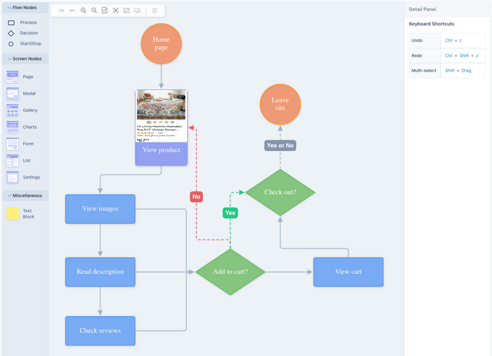
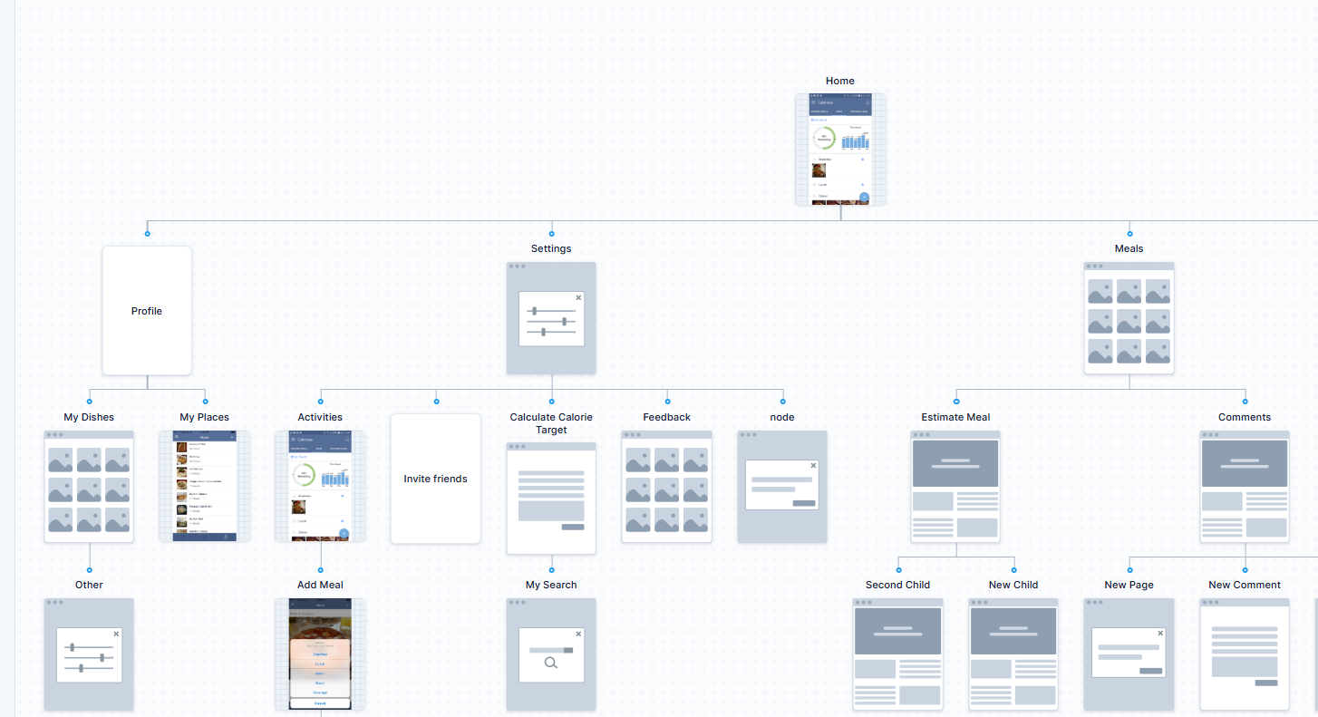
Flow diagrams and visual sitemaps
These tools are invaluable when considering the Gestalt principle of continuity. A user's journey through a website or application should feel seamless, with elements flowing naturally.
UserBit's flow diagrams and visual sitemaps ensure that designers can craft experiences that resonate with this sense of uninterrupted progression.


Client portal
Gathering insights and feedback continually is essential in the UX design process. This iterative feedback loop ensures that as designs evolve, they consistently align with user expectations and perceptions, grounded in Gestalt principles.

Real-time comments and custom branding
Collaboration and real-time feedback among team members can bring to light unique interpretations of Gestalt principles.
With UserBit's collaborative tools, teams can converge on design decisions that best resonate with these principles while maintaining a cohesive brand identity.
UserBit, as an all-in-one UX platform, is here to help you master and apply Gestalt principles in your projects. With our full suite of features, we ensure you have the resources needed to create designs that truly resonate with user perceptions and expectations.

