
How User Flow Shapes Meaning in UX Design
Have you ever opened an app and felt instantly lost, not because it looked bad, but because you didn’t know what to do next? That feeling doesn’t happen by accident. It happens when a product is built without a clear path in mind.
A user flow diagram isn't just a diagram filled with boxes and arrows. It maps out every step users take from their first interaction with your product to the final action you want them to complete. But not all user flows are good user flows. Some create clarity and momentum, and others create friction and drop-offs.
In this article, we’ll break down what separates a weak user flow from a strong one and learn about the important characteristics that make a user flow effective, strategic, and user-centered.
What is a user flow?
A user flow is not just a UX deliverable or a diagram that designers create to tick a box. Creating a flow diagram is a structured way of understanding how someone moves through your product to accomplish a specific goal.
Let’s break it down properly.
A user flow is a visual representation of the exact steps users take to complete a task within a product. It shows:
-
Where the users start
-
What actions they take
-
What decisions they make
-
How the system responds
-
Where they end up
User flow is not about screens only, but also about users' behavior. What users do, not just where they go. For example, imagine someone wants to buy a product online. A basic user flow might look like this:
1. User lands on product page
2. Clicks “Add to Cart”
3. Views cart
4. Proceeds to checkout
5. Enters shipping details
6. Completes payment
7. Sees confirmation screen.
The above sequence is a user flow, but in reality, it’s often more detailed. What if the payment fails three times and the user switches cards? What if they abandon after seeing a $300 delivery fee? What if the user isn’t logged in? What if they remove the item? A proper user flow captures those variations, too.
Unlike a simple sitemap, which just shows pages, user flow diagrams focus on actions and decisions. They answer the question: “What does my user do, and what happens next?”
If you're interested in learning how to structure and create one effectively, you can explore this step-by-step guide on creating a user flow diagram.
How user flow shapes meaning in UX design
Polished diagrams don’t make a flow useful. What matters is whether it reflects how people actually behave. It represents real user behavior and how effectively it supports the user’s goal.
Let’s explore the core characteristics that make a user flow strong.
1. A good user flow starts with one clear goal
The biggest mistake beginners make is starting to draw before deciding what the user is trying to achieve. Before you open any tool or draw a single arrow, pause and answer this question:
What is the exact outcome the user wants?
For example, “Create an account” is a clear goal. “Explore the platform” is not. “Complete checkout” is clear. “Engage with the product” is vague.
Your flow becomes cluttered when your goal is unclear. You keep adding unrelated steps. You mix onboarding with payments and create something that looks complex and provides no clarity. A strong user flow always focuses on one main task. If you realize your diagram is becoming too big, then maybe you’re trying to solve more than one goal. If yes, then split it into separate flows.
Sometimes this also happens, that even when your goal is clear, the flow becomes messy as you add more detail. In that case, using a flow optimization feature of Flows by UserBit might help simplify and restructure your diagram without losing its intent.
Many structured product guides for user flows recommend naming your flow after the user’s goal. When your flow has a precise name like “New User Signup (Mobile)” instead of “User Flow 1,” everyone understands its purpose and works accordingly.
Clarity at the start determines the quality of everything that follows.
2. It defines the real entry point
Once the goal is clear, the next step is to understand where the journey starts. Many people simply write “Homepage” as the first step. But that’s often unrealistic. Users rarely appear out of nowhere.
-
Did they click a Google search result?
-
Did they tap on an Instagram ad?
-
Did they open the app because they received a notification?
-
Are they already logged in?
The entry point shapes the user’s mindset. Someone arriving from a discount ad expects to see that offer immediately, or maybe someone returning to the app expects speed and familiarity. People who are visiting for the first time might need more reassurance.
A well-structured flow clearly defines the entry point and becomes grounded in real behavior instead of assumptions. By defining a real entry point, you shift your thinking from “How does our product work?” to “How does a real person experience this product?”
And that shift changes everything.
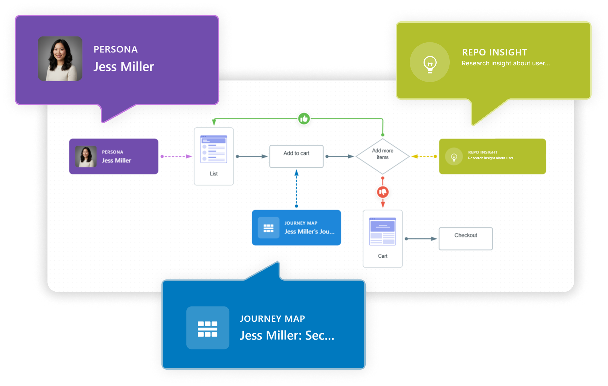
3. It links flow to personas, journey maps, and research repository
A modern user flow is more than just a diagram — it’s a living document connected to real insights. In tools like Flows by UserBit, you can attach each flow step directly to a persona, a journey map, or a research repository insight. This means your flow is no longer abstract; it’s grounded in data.
For example, a “Payment Hesitation” step can link to a persona who’s risk-averse, a journey map showing common friction points, or usability testing notes highlighting where users abandon the checkout.
By integrating flows to personas, journey maps, and research repository insights, every design decision becomes traceable and evidence-based. Teams can understand not just what happens in the flow but why it happens, making the flow a strategic asset rather than just a visual reference.
4. It focuses on actions, not just screens
A common misunderstanding is thinking that a user flow is just a sequence of pages. It’s not. If you map it like this:
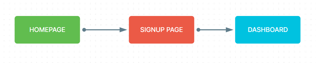
You’re only describing structure. You’re not describing the experience. A meaningful user flow explains what the user does and how the system responds. For example, instead of writing “Signup Page,” you would show:
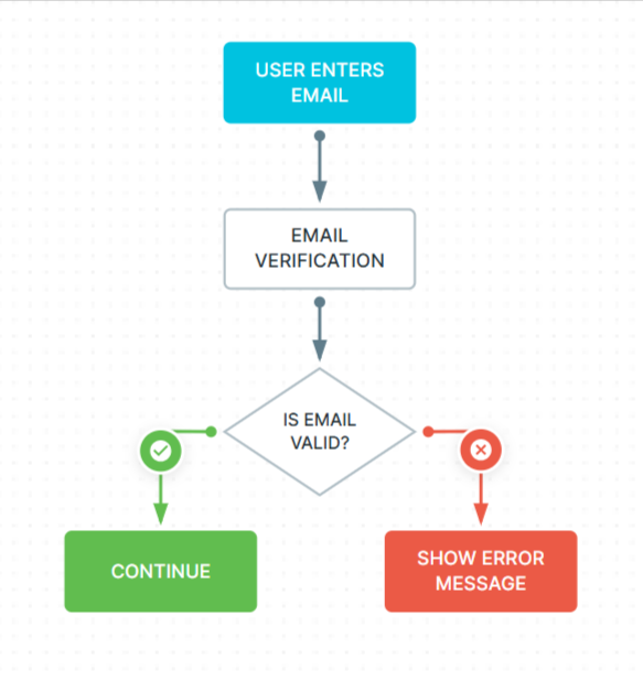
Now the flow tells a story. It shows interaction, feedback, and consequences.
This level of detail is important because products are not static. They respond to users. They validate input. They show errors. They confirm actions. These micro-moments often determine whether the experience feels smooth or frustrating.
When mapping your flow — especially inside a dedicated UX tool — it becomes even more powerful if you connect these steps to real research insights. For example, if users complained that “the form feels too long,” attaching that insight directly to the form step turns your flow into a strategic document rather than just a visual map.
The difference is subtle, but it matters more than most teams realize. Screens represent what the interface looks like, but actions show behavior and reveal what users actually do. While layouts help you design visually, behavior helps you design strategically.
A product isn’t just a collection of screens; it’s a sequence of decisions, interactions, and responses. That’s why you should always map behavior first. When you focus on actions instead of just screens, you design experiences that work, not just interfaces that look good.
5. It includes decision points and real-world mistakes
Here’s something critical: users don’t behave perfectly.
-
They enter the wrong password.
-
They hesitate at payment.
-
They abandon the process halfway.
-
They change their mind.
If your user flow only shows the happy path, it’s incomplete. For example, imagine a checkout flow. If you only show:
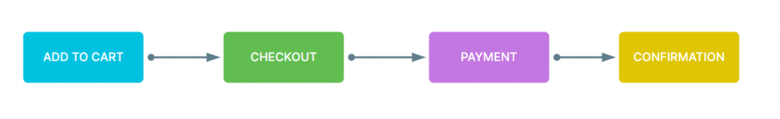
You’re ignoring reality. What happens if the card fails? What if the item is suddenly out of stock? What if the user sees the shipping cost and decides it’s too high?
Real users don’t follow perfect paths. They hesitate, change their minds, and run into problems. A strong user flow accounts for these moments. Decision points are where user experience often breaks. These are also the moments where small improvements can increase conversion rates.
By including alternative paths such as error states, retry options, exit points, your user flow becomes realistic and useful. It stops being optimistic and starts being practical. Many teams discover their biggest UX problems only after mapping these alternative routes.
6. It considers emotional awareness in the journey
Now we move into something that beginners rarely think about: emotion. Every step in your user flow carries a feeling. At the payment stage, users might feel anxious. On a long registration form, they may feel overwhelmed. After completing a task, they might feel relieved or satisfied.
A user flow becomes much stronger when you consider these emotional moments.
For instance, if you know users often hesitate at the pricing page, then that’s not just a step in the flow; it’s a friction point. Here, you might need clearer explanations, trust badges, testimonials, or guarantees to reduce the hesitation.
By adding small notes about potential hesitation, confusion, or motivation, you design with empathy instead of assumptions. Some product teams even attach interview quotes or usability testing insights directly to flow steps. These small notes keep the flow connected to real human behavior rather than internal opinions.
Emotion is invisible in diagrams unless you intentionally look for it.
7. It reviews, simplifies, and challenges every step
Your job isn’t finished once your flow is complete. Now you step back and challenge it. Look at every step and ask:
-
Is this necessary?
-
Can this be combined with another step?
-
Is this here because users need it or because the business wants it?
Flows often become complex over time as features are added and requirements pile up. Extra validations appear. The experience becomes heavier without anyone noticing. Simplification is one of the most powerful UX improvements you can make.
A helpful exercise is to walk someone unfamiliar with UX through your flow. If they struggle to understand it within a minute, then believe me, it’s too complicated. You have to simplify it properly, and the goal of a user flow should be clear and not complex.
When simplified properly, a user flow becomes a shared language between designers, developers, product managers, and stakeholders. Simplification of the flow prevents confusion before development begins, and that saves time, money, and frustration.
Why these characteristics truly matter
When you follow these characteristics, like defining clear goals, understanding entry points, mapping actions, including real-world decisions, considering emotions, and simplifying thoughtfully, you stop designing randomly and start designing intentionally.
A well-crafted user flow helps you:
-
Identify friction before it reaches users
-
Improve conversion rates
-
Align your team around one clear journey
-
Make research-backed decisions
-
Build experiences that feel smooth and intuitive
And once you start thinking about flows, you’ll notice something powerful: your product decisions become clearer, your conversations become more focused, and your designs become more user-centered. And then your user flow stops being just a diagram and becomes one of the most valuable tools in your product development process.
User flow example
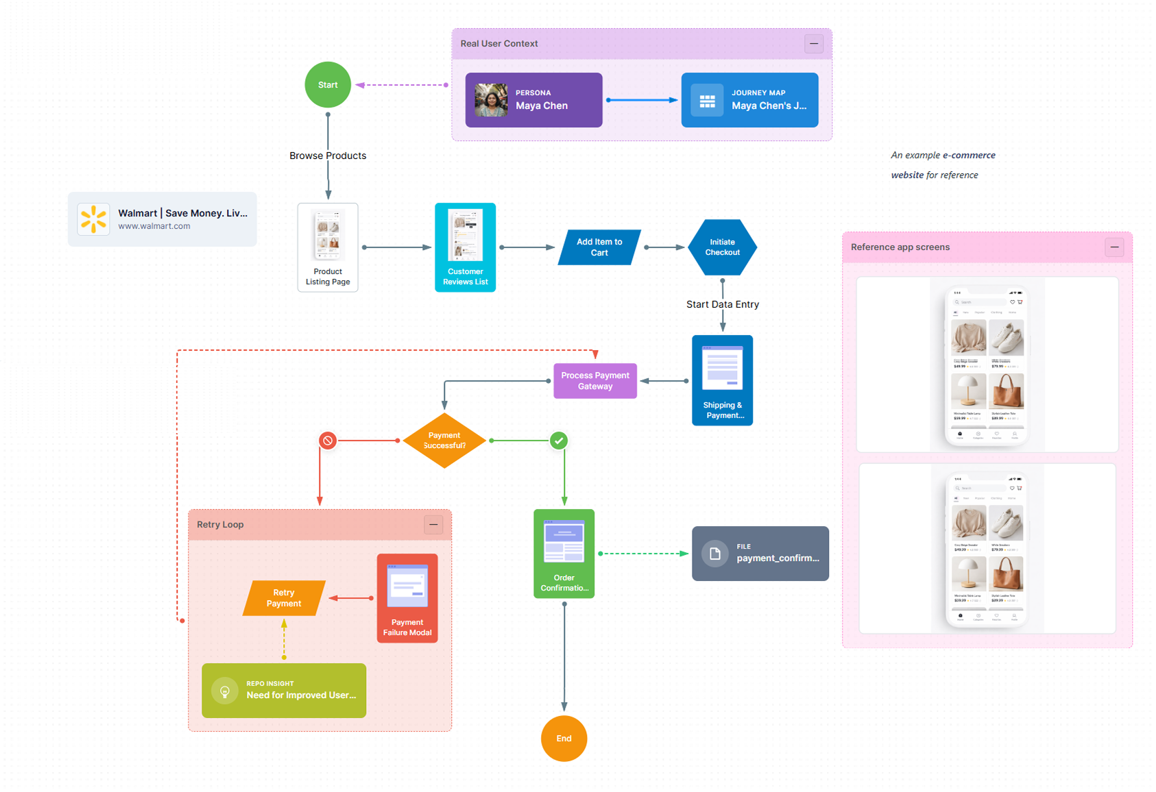
This e-commerce checkout flow illustrates the end-to-end journey from product discovery to order confirmation. It highlights key user touchpoints such as browsing, cart addition, payment processing, and failure handling through a retry loop. The flow emphasizes a seamless experience while accounting for real-world scenarios like payment errors and recovery paths.
Final thoughts
When you take the time to define a clear goal, understand real entry points, map actions instead of pages, and account for mistakes and emotions, you’re doing more than organizing steps. You’re shaping the experience before it ever reaches development.
A strong user flow helps you see friction early, challenge unnecessary complexity, and align your team around a shared understanding of how users actually move through your product. It transforms assumptions into intentional decisions and ideas into structured journeys.
Most importantly, it forces you to think from the user’s perspective, not the interface’s.
Because great products don’t happen by accident. They happen when every step is considered, every decision is intentional, and every path leads users forward with confidence. Master user flows, and you’ll stop designing screens in isolation — you’ll start designing experiences that feel seamless from beginning to end.
