
How to Gather Customer Data for Journey Mapping - Qualitative vs. Quantitative Explained
Customer journey maps look pretty fancy. You’ve got sticky notes, empathy curves, and flow arrows. But what are you asking yourself when you make these maps? How true are they? Are they taken from user behaviors? Or simply assumptions made by your team in a workshop?
A journey map is only as useful as the data behind it. If you’re not grounding it in real customer insights, you’re just making a pretty flowchart.
That’s why gathering the right kind of customer data is critical. There are usually two main types: qualitative and quantitative. One gives you the “why”, and the other gives you the “what”. Both are essential to see the full picture of your user’s experience.
In this post, we’ll break down what qualitative and quantitative data mean in the context of journey mapping, how to gather them, and how to use them together to build maps that drive real UX improvements.
What is customer data in journey mapping?
Journey mapping relies on empathy and understanding the customer's experience from start to finish. This method requires insight, which comes from customer data.
Customer data in journey mapping refers to all the information you collect about how users interact with your product or service, including their actions, thoughts, feelings, pain points, and goals at each touchpoint. This data ensures the map reflects user reality, not assumptions.
Since user journeys are rarely linear, using only one type of data creates blind spots. Therefore, understanding both qualitative and quantitative methods is crucial.
Understanding qualitative vs. quantitative data
Let’s start with the basics.
Qualitative data is exploratory. It’s the kind of data you get when you talk to people, watch them use your product, or ask open-ended questions. It helps you understand the motivations, frustrations, and emotional context behind user behavior.
Think of it like a conversation. You learn a lot about someone not just by what they say, but also by how they say it, what they emphasize, and what they leave unsaid.

Quantitative data, on the other hand, is all about the numbers. It tells you what’s happening, how often it’s happening, and whether it's getting better or worse over time. This type of data includes metrics like conversion rates, click-throughs, bounce rates, or Net Promoter Score (NPS) scores.

By combining both, you get the full story. For example, if analytics show users are dropping off after signing up, qualitative interviews might reveal they’re confused by the onboarding process. One shows the pattern, and the other shows the reason behind it.
So, how do you go about collecting this data?
1. User interviews & observations (qualitative)
Nothing beats sitting down with users (virtually or in person) and hearing their stories. Ask open-ended questions and dig deeper when they mention a struggle. Conducting great remote user interviews requires preparation, active listening, and the right tools to capture insights effectively. Tools like Journey Maps by UserBit let you tag key insights and turn them into visual artifacts for journey maps.

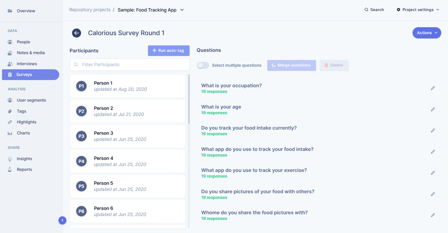
2. Surveys (qualitative & quantitative)
A good survey can be double what you need. Use Likert scales and multiple-choice questions for quantifiable patterns. Include open-ended prompts to capture user sentiment. Just make sure you’re not asking leading questions.
For example, a leading question might be, “How much did you enjoy our excellent customer service?” — This assumes the respondent had a positive experience. A non-leading version would be, “How would you rate our customer service?” or “Please describe your experience with our customer service.”
Similarly, instead of asking, “Why do you prefer our product over others?” — which assumes they already prefer it — you could ask, “How does our product compare to others you’ve used?” or “What factors influence your choice of product?”
Pro tip: By avoiding leading phrasing, you gather more accurate, unbiased feedback that truly reflects user opinions.
3. Web & app analytics (quantitative)
Analytics tools are your bird’s-eye view of user behavior. They reveal how users move through your flow, where they drop off, and what actions they repeat or abandon. Platforms like Google Analytics can uncover hidden friction patterns that qualitative data might not immediately show.
Here’s what to look for:
-
Drop-off rates: At which specific step do users leave the flow?
-
Time on task: Are users spending too long on a certain screen or step?
-
Rage clicks or repeated taps: Signs of frustration or unclear interactions.
-
Path analysis: How do users actually move between pages or screens — and is it the flow you expected?
Combine these insights with your qualitative notes to understand not just where friction happens, but why.
Pro tip: Always contextualize analytics data. Numbers show symptoms; user interviews reveal causes.
4. Support tickets and chat logs (qualitative)
Your support team is sitting on a goldmine of user insight. Every ticket, email, or chat transcript is a direct look into user pain. By analyzing recurring complaints or confusion, you can uncover journey-level friction that may never surface in analytics.
Look for patterns:
-
Repeated “how do I…” questions about the same step? That’s a UX clarity issue.
-
Frequent refund or cancellation requests? That might indicate a mismatch between expectation and experience.
-
Users abandoning midway and contacting support for help? That’s a red flag in your flow logic or feedback loops.
Pro tip: Invite support representatives into your audit workshop — they’re often the first to notice when a small UX issue turns into a big frustration trend.
5. Social listening and reviews (qualitative)
Beyond direct feedback, social spaces give you unfiltered, honest opinions. Users talk freely on forums, social media, Reddit threads, and review platforms — often mentioning pain points they never report through official channels.
Monitor brand mentions and keyword phrases related to your product or competitors. Manual scans on platforms like Twitter/X or Reddit can uncover what users think about specific parts of your experience.
Pay attention to:
-
Spontaneous praise or complaints about specific steps (“Took forever to check out,” “Loved how easy the setup was”).
-
Comparative insights (“Unlike Product X, this one actually lets me…”).
-
Emerging themes — sometimes, small usability issues gain traction when echoed by multiple users.
Social listening adds a valuable real-world context to your audit — it helps validate whether the friction you observed in testing truly resonates at scale.
How to use the data in journey mapping
Once you have your data, it’s time to connect the dots.
Start with qualitative insights to map emotional highs and lows, such as what frustrates users, what delights them, and where confusion happens. Layer in quantitative data to validate those patterns. For example, if several users mention feeling stuck during checkout, and your analytics show high cart abandonment at that step, that’s a clear hotspot.
Use this blended insight to build each stage of the journey with empathy and evidence. Label touchpoints with real quotes and metrics. Show where things break down and what needs improvement.
And don’t forget to tie it back to business goals. A map should guide product decisions, not just live in a UX folder.
Common mistakes to avoid
Relying only on one data type: If you only look at numbers, you miss the human story. If you only conduct interviews, you may misjudge the extent of an issue.
Forgetting emotional context: A journey map isn’t just a series of steps. It's about how users feel during those steps. Don’t lose sight of that.
Mapping from internal assumptions: Your team’s perspective is valuable, but it shouldn’t be the source of truth. Always validate with real user data.
Conclusion
User experience can make or break your product. Journey maps are a powerful way to understand and improve that experience — but only if they’re grounded in real customer data.
By combining qualitative depth with quantitative scale, you get a 360-degree view of your users’ journey. It’s not just about checking boxes. It’s about connecting the right data points to the right decisions.
Whether you're building your first journey map or refining an existing one, start with the data. Talk to users, track their behavior, and use those insights to design experiences that actually work for them.
Want to turn your research into actionable journey maps? Platforms like Journey map by UserBit help you collect, tag, and organize both qualitative and quantitative insights so your maps reflect the real customer story, not just your best guess.
