
How to Combine Card Sorting with Other UX Research Methods
Different UX methods reveal different angles of user behavior. Card sorting shows how users group information, but it doesn’t reveal how they interact with that structure in real scenarios. That’s the reason combining research methods is so valuable.
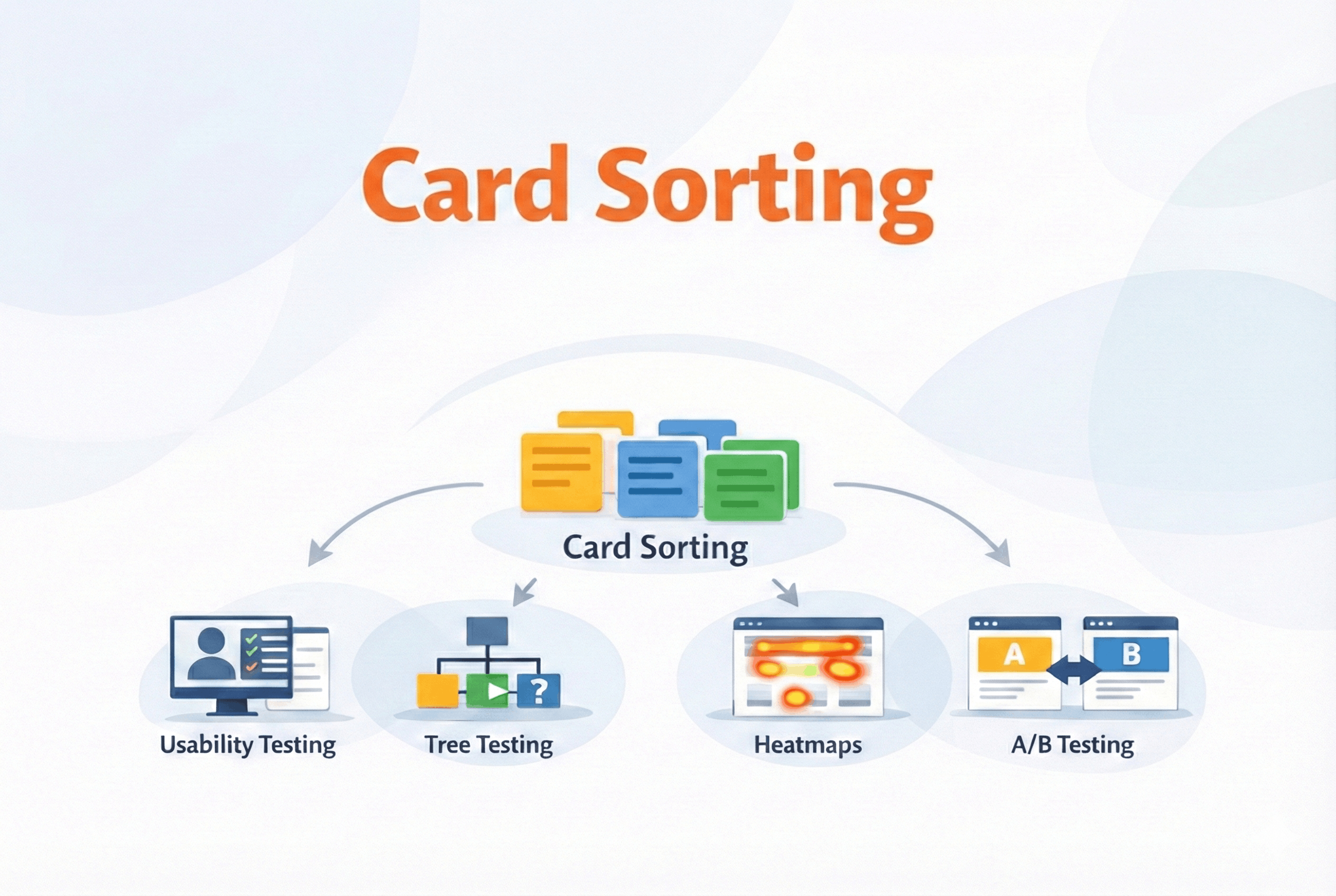
UX research often feels like detective work. One method gives you a clue, but you see the full picture only when you connect insights from multiple sources. Card sorting uncovers mental models, usability testing reveals behavior, heatmaps show attention patterns, tree testing validates structure, and A / B testing fine-tunes it all.
By combining the right methods at the right time, you avoid blind spots, balance qualitative and quantitative insights, and design with confidence — grounded in how users think and act. Here’s how card sorting works alongside other techniques to create smarter, user-driven experiences.
Card sorting + Usability testing
Card sorting helps you build a content structure that aligns with how users think, but how do you know whether that structure actually works in a real interface?
Card sorting helps you understand how users expect information to be organized. Usability testing shows how well that organization holds up when people try to complete tasks: where they click, what confuses them, and how easily they can complete key tasks.
So how do these two actually work together?
Let’s say you’ve used card sorting to design your site’s navigation. You grouped features based on how users naturally categorize them. That’s a strong starting point — but it still needs to be tested in real use.
A usability test lets you validate whether users:
-
recognize the category labels you created
-
can quickly find the right content or feature
-
get confused or misinterpret a section
By observing real user behavior, you can refine the IA decisions made through card sorting. Sometimes the grouping makes sense in theory, but fails in reality — usability testing reveals those breakdowns early.
A common way teams use this combination
In most projects, this pairing looks something like this:
-
Start with open card sorting to understand how users group content.
-
Design navigation or page layout based on those insights.
-
Run usability tests using realistic tasks (e.g., “Find pricing details for the premium plan”).
-
Iterate on structure, labels, or hierarchy based on test results.
You don’t need huge participant numbers. 20–30 users for a card sort, and just 5–8 for usability testing can reveal the majority of usability issues.
When used together, card sorting and usability testing help you move from theoretical structure to proven usability. One builds the map, and the other tests the journey.
Card sorting + Tree testing
Card sorting and tree testing are often mentioned in the same breath, and for good reason. They’re two sides of the same information architecture coin.
Card sorting is exploratory, it helps you generate ideas for organizing content. Tree testing is evaluative, it helps you confirm whether users can find things within that structure.
Why use both?
Imagine you run a card sorting study and discover that users consistently group certain features under “Account Settings”. That gives you a solid hypothesis for your IA. But now you need to validate: can users actually locate those features in your proposed structure without the help of design elements like icons or visual hierarchy?
Tree testing strips away the UI and asks users to move through a plain-text version of your site’s hierarchy to complete simple tasks. If they struggle, you know it’s the structure that needs work, not the interface.
One effective sequence is:
-
Card Sorting → Understand how users mentally group content.
-
Draft Your IA → Build a logical hierarchy based on sorted results.
-
Tree Testing → See if users can find content in that hierarchy.
-
Refine → Adjust labels, nesting, or categorization as needed.
Let’s say you’re designing a knowledge base. Card sorting shows that users group "Invoices" with "Billing" rather than "Reports". You structure your sitemap accordingly. In tree testing, users are asked, “Where would you go to download your past invoices?” If most users find it under "Billing", great — you’ve validated the IA. If not, time to adjust.
Together, these two methods help when your main goal is making sure people can find things without friction.
Card sorting + A / B testing
Even after a good card sort, some decisions still feel like guesswork — especially label choices. Card sorting helps you structure content, but what about optimizing how it performs? That’s where A / B testing enters the picture.
While card sorting gives you a solid first draft of your information architecture — groupings, labels, and navigation — A / B testing lets you refine those decisions using real user behavior.
How do they work together?
Imagine your card sorting study revealed two possible labels for the same category: “Help Center” and “Support”. You decide to use “Help Center” in your final structure, but you’re unsure which resonates better with actual users.
That’s exactly the kind of decision A / B testing is good at answering.
-
A version: Navigation uses “Help Center”
-
B version: Navigation uses “Support”
You then track which version leads to more successful task completions, lower bounce rates, or higher engagement.
What A / B testing adds
-
It shows you which label people actually click on.
-
It allows you to test variations without guessing.
-
It helps optimize not just structure, but also copy and placement.
A / B testing makes the most impact once your structure is mostly stable and you’re deciding between a few viable options. When used together, card sorting gives you the ‘why’, while A / B testing gives you the ‘what’.
Card sorting + Heatmaps & click tracking
Once your structure is live, the big question becomes: Are users interacting with it the way you expected? Here’s where heatmaps and click tracking come in.
Card sorting helps you design the structure. Heatmaps show how users interact with that structure once it’s live.
What heatmaps reveal that card sorting can’t
While card sorting gives you valuable up-front guidance, it’s done in an abstract setting. You’re working with content labels, not actual UI elements. Heatmaps take that structure into the real world and let you observe:
-
Are users clicking the categories you thought were obvious?
-
Is important content being missed because of its placement?
-
Are there unexpected hotspots or dead zones?
For example, your card sort grouped several support options under “Help Center.” You placed that in the footer, assuming users would scroll for it. But heatmap data shows almost no one is clicking it there.
You now know the problem isn’t the grouping — it’s the visibility. That’s something only a tool like a heatmap or a scroll map could reveal.
When you want to see what happens after launch
Most teams approach it like this:
-
Run card sorting to shape the structure.
-
Launch the new IA.
-
Use heatmaps to observe real usage.
-
Iterate based on how people actually interact with the interface.
When paired together, card sorting and heatmaps let you know how users say they organize information and how they behave in practice.
You don’t need every UX method every time
It’s worth saying this clearly: you don’t need to run every UX research method on every project.
In practice, most teams combine just one or two methods, sometimes three depending on what they’re trying to learn, how much time they have, and where the product is in its lifecycle.
Here’s how card sorting typically fits into different situations.
Scenario 1: “We’re building something new, and the navigation is still unclear”
You’re early in the product or feature. Content is piling up, and everyone on the team has a different opinion about where things belong.
You might start with an open card sort to shape the structure, translate those patterns into a draft navigation, and then use tree testing to check whether people can move through it as expected.
Scenario 2: “The navigation exists, but users still feel confused”
Nothing is technically “broken,” but people hesitate, take longer than expected, or ask support questions that point to findability issues.
One way teams approach this is by revisiting the existing structure through a closed card sort, then observing real task behavior through usability testing.
Scenario 3: “The product is live, and we’re trying to improve performance”
The structure is already in place. Now the focus is on engagement, discoverability, and small improvements that move metrics.
Here, heatmaps and click tracking help surface interaction patterns, while A/B tests are used to compare small variations in labels, placement, or order.
Scenario 4: “We don’t have much time or easy access to users”
Deadlines are tight. You might only get a handful of participants, or a short research window.
When time or access to users is tight, even a quick card sort can highlight major structural issues, and a brief usability test can help check the key flows that matter most.
The takeaway
Card sorting isn’t a step you take every time — it’s a foundation. Once structure is clear, let the next method guide your next move. Use fewer methods, but use them intentionally. Make the most of your time and resources by using methods with purpose.
