Add bar and pie charts to journey maps with the new chart lane
Journey maps now support a new Chart lane, allowing you to visualize key data points directly inside the map.
You can choose between two chart types — Bar Chart and Pie Chart — to represent metrics, ratios, distributions, or any data that helps tell your user's story more clearly.
Why this matters:
- Use charts to add context around pain points, sentiment, effort, or behavior.
- Keep insights in one place, reducing the need to jump between tools or documents.
- Bring quantitative context directly into your journey maps.
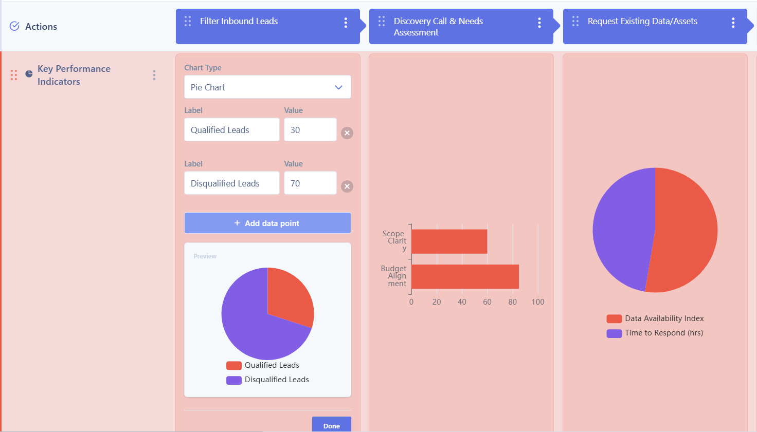
Journey map chart lane UI
Try it today!